
Cut Churn: Product Usage Analytics for SaaS, Backed by 44,000 Users


Product usage analytics tracks what individual users actually do inside your product, event by event, session by session, so you can see exactly where they find value and where they stall out. The core payoff is simple: you catch activation failures and retention risk early enough to fix them. Customerscore's 44,000-user retention study found specific engagement patterns predict churn months out, and a handful of metrics, activation rate, feature adoption, DAU/MAU, do most of the predictive work.
TL;DR:
- Activation rate should be measured within the first 7 to 14 days, focusing on meaningful actions like task creation rather than simple logins.
- Retention analysis uses cohort curves to identify whether user activity levels remain stable over time, signaling healthy product engagement.
- Tracking both gross and net churn provides a complete picture of account cancellations and revenue expansion, preventing misinterpretation of growth.
- Early feature adoption and deep engagement with core workflows outperform login frequency as predictors of long-term retention.
- Use instrumented, schema-controlled tracking with identity resolution to ensure trustworthy data and facilitate accurate, cross-platform, multi-session analysis.
Table of Contents
- What Is Product Usage Analytics SaaS Teams Actually Need?
- Which Metrics Should You Track First?
- Which Capture Model Fits Your Engineering Team?
- How Do You Instrument Usage Tracking Correctly?
- How Do You Turn Usage Data Into Real Actions?
- What Do These Playbooks Look Like in Practice?
- What Did the 44,000-User Study Actually Find?
- Which Analytics Approach Fits Your Team Right Now?
- Three Priorities for the Next 90 Days
- Put Usage Signals to Work With Customerscore
- Sources
What Is Product Usage Analytics SaaS Teams Actually Need?
Product usage analytics measures behavior at the person level, not the page level. Every click, feature toggle, and workflow completion gets tied to a specific user and a specific account, then stitched together across every session that user has, on any device, over the life of their subscription. That's the fundamental difference from marketing analytics, which mostly counts anonymous pageviews and traffic sources.
Web analytics tools answer "how many people visited the pricing page?" Product usage analytics answers "did the three people at Acme Corp who visited the pricing page ever create a second workspace, and did that correlate with them upgrading?" The unit of analysis shifts from sessions to people, and the timeframe shifts from a single visit to the entire customer lifecycle.
This distinction matters because SaaS retention decisions require longitudinal, person-level data:
- Identity resolution: an anonymous trial user becomes a known account, and every action before and after the conversion needs to link to the same profile.
- Cross-device stitching: a user who onboards on desktop and returns on mobile still needs a unified activity record.
- Multi-session journeys: activation rarely happens in one sitting. Tracking has to span days or weeks, not a single visit.
- Account-level rollups: in B2B SaaS, the buying unit is the account, so individual user events need to aggregate up to account health.
Marketing analytics is decisive for acquisition: which channel, which campaign, which landing page drove the signup. Product usage analytics takes over the moment someone logs in, and it stays decisive through onboarding, feature adoption, renewal, and expansion. Teams that only run marketing analytics tools can tell you how many trials started.
Which Metrics Should You Track First?
Six metrics cover most of what a SaaS product team needs to run a usage analytics program without drowning in dashboards. Start here before adding anything else.
Activation rate measures the percentage of new users who complete a defined "aha" action within a set window, usually the first 7 to 14 days. The formula is straightforward: (users who complete the activation event ÷ total new signups) × 100. The hard part is picking the right event. A project management tool might define activation as "created a task and assigned it to a teammate," not just "logged in," because the second action predicts habitual use far better than the first.
Retention is best visualized as a cohort curve: group users by signup week or month, then plot what percentage of each cohort is still active at day 7, day 30, and quarter 1. A healthy SaaS retention curve flattens rather than continuing to decline. If your day-30 line keeps sliding toward zero at day 90, you have a product problem, not a marketing problem.
Churn comes in two flavors that get confused constantly. Gross churn counts every canceled account, full stop: (canceled accounts ÷ starting accounts) × 100 over a period. Net churn subtracts expansion revenue from contraction and cancellation, which is why a company can post negative net churn (growing revenue from existing customers) while still losing individual logos. Track both. Gross churn alone hides the fact that big accounts are quietly compensating for small-account losses.
Feature adoption and stickiness track whether a specific feature gets repeat use, not just a first click. A common formula: (users who used feature X in the last 30 days ÷ total active users) × 100, paired with a "stickiness" ratio of daily feature users to monthly feature users.
Time to value (TTV) is the elapsed time between signup and the first moment a user experiences the product's core benefit. Definitions vary by product: for a scheduling tool, TTV might be "first meeting booked through the app." For an analytics platform, it might be "first dashboard shared with a teammate." Measure it in hours or days, and treat any reduction in median TTV as a leading indicator of better activation.
Engagement ratios round out the picture. DAU/MAU (daily active users divided by monthly active users) tells you what fraction of your monthly base is showing up regularly; a ratio above 20% is generally considered strong for a workplace SaaS tool, though the right benchmark depends heavily on your product's expected usage frequency.
| Metric | Formula | Typical measurement window |
|---|---|---|
| Activation rate | Activated users ÷ new signups × 100 | 7 to 14 days post signup |
| Gross churn | Canceled accounts ÷ starting accounts × 100 | Monthly or quarterly |
| Feature adoption | Users of feature ÷ total active users × 100 | Rolling 30 days |
| DAU/MAU ratio | Daily active users ÷ monthly active users | Rolling 30-day window |
| Time to value | Days from signup to first value event | Product-specific |
Pro Tip: Pick one activation event and one retention window before you build anything else. Teams that try to instrument ten "north star" candidates at once usually end up with none they trust.
Customerscore's retention research found that the strength of the correlation between early feature adoption and 12-month retention was one of the clearest signals in the 44,000-user study, stronger than login frequency alone. Frequency tells you someone shows up. Adoption tells you they're getting something done.
Which Capture Model Fits Your Engineering Team?
The tool category you pick determines how fast you get answers and how much engineering time you burn getting there. Four models dominate, and each has a real trade-off.
Event SDKs give you precise, deliberate tracking: you decide exactly which events and properties matter, name them, and fire them from code. The upside is data you can trust down to the property level. The downside is real: every new question often means a new instrumentation ticket, and event-based platforms demand strict discipline to stay usable as the taxonomy grows.
Autocapture and visual tagging flip that trade-off. These tools record interactions automatically and let teams tag features and pages after the fact, which means a PM can define a new funnel step without waiting on a sprint. The cost is noisier data and less control over property-level detail, since you're working with what got captured generically rather than what you specifically asked for.
Session replay and heatmaps aren't really competitors to the first two. They're the qualitative companion that explains the "why" behind a metric drop. A funnel might show a 30% drop at the payment step; only replay footage of actual users hitting that step shows you the confusing error message or the mispositioned button causing it. Treat replay as your diagnostic layer, not your primary measurement system.
Real user monitoring (RUM) matters when performance, not confusion, is the culprit. If page load times or API latency are driving drop-off, standard event analytics won't surface that. RUM tools track actual load times and errors experienced by real users, which becomes essential once you rule out UX friction as the cause of a funnel leak.
The stack decision underneath all of this: warehouse-first or hosted analytics. Warehouse-first setups pipe raw event data into a data warehouse and let analysts query it with SQL or spreadsheet-style tools, an approach that has gotten faster as products like Quadratic reimagine spreadsheets around data work instead of static grids. Hosted analytics platforms trade some of that flexibility for speed, giving product teams dashboards and funnels out of the box without waiting on a data team.
- Choose event SDKs when data precision and governance outrank speed.
- Choose autocapture when you need answers this week and can tolerate messier detail.
- Add session replay wherever a funnel metric drops and you don't know why.
- Add RUM when performance is a plausible suspect behind a drop-off.
- Choose warehouse-first when your team already has SQL fluency and cross-tool joins matter.
How Do You Instrument Usage Tracking Correctly?
Bad instrumentation is the single most common reason product usage analytics gets abandoned six months in. The data becomes untrustworthy, nobody wants to build on it, and the whole program quietly dies. A disciplined rollout avoids that.
- Build a tracking plan before writing any code. List every event you need, its properties, and who owns the definition. Start with the smallest set of events required to define activation and your primary funnel, then expand into feature-adoption tracking once that foundation is solid.
- Solve identity stitching early. Map anonymous visitor IDs to known user IDs the moment someone signs up, and link every user ID to an account ID. Skipping this step means your retention cohorts will be wrong from day one.
- Set naming conventions and a schema registry. Decide on a consistent format (object_action, like "invoice_sent") and enforce it through a shared schema, not tribal knowledge. Inconsistent event naming across teams is what turns a clean tracking plan into an unusable mess within a year.
- QA every event before it ships. Fire test events in a staging environment, confirm properties populate correctly, and spot-check a sample of live events after launch rather than assuming the pipeline works.
- Wire up your integrations in priority order. Billing data tells you who's paying and how much. CRM data tells you deal stage and account owner. Support ticket volume flags friction the product data alone won't show. A data warehouse ties it all together for cross-functional analysis.
- Set privacy guardrails before you collect anything sensitive. Decide what counts as personally identifiable information, mask or exclude it at the point of capture, and document retention periods.
Getting identity stitching and a consistent taxonomy right early is what separates usage data teams actually trust from data that gets quietly ignored after the first bad report. The integrations worth prioritizing, in order of typical payoff: billing systems (Stripe, Chargebee), CRM (HubSpot, Salesforce), support tools (Intercom), and your warehouse. Each adds a dimension that raw product events can't provide on their own.
- Billing integration reveals which usage patterns precede upgrades or downgrades.
- CRM integration connects usage signals to account owner and renewal date.
- Support integration flags friction that shows up as ticket volume before it shows up as churn.
- Warehouse integration lets you join product, billing, and CRM data for account-level health scoring.
How Do You Turn Usage Data Into Real Actions?
A dashboard that nobody acts on is a wasted instrumentation budget. The path from metric to outcome runs through hypothesis, targeting, intervention, and measurement, in that order.
Start with the drop. That's a location, not an explanation. Pull session replay for a sample of users who dropped at that exact step, since replay footage shows the specific interaction that a funnel chart can't. Maybe the API key field has no inline validation and users think it's broken. Now you have a testable hypothesis instead of a guess.
Segment before you intervene. Not every user needs the same nudge. Split by plan tier, company size, or days since signup, and target the specific cohort exhibiting the risky behavior rather than blasting every user with the same in-app message.
From there, the standard playbook options are:
- In-app guides and tooltips for friction inside a specific step, deployed only to the segment hitting that step.
- Targeted email or in-app nudges for users who've stalled for a defined number of days without completing activation.
- Automated alerts to customer success when an account's health score drops below a threshold, triggering a human outreach playbook rather than another automated message.
- A/B tests comparing the current flow against a modified version, run long enough to reach a clear read on the specific metric you changed it to move.
Define success and rollback criteria before you launch, not after you see the results. If activation rate needs to move by a meaningful margin within two weeks to justify a permanent change, write that down before the test starts. Tying every experiment back to one canonical health signal, so product, analytics, and customer success all reference the same event stream, keeps teams from arguing about whose dashboard is right.
Pro Tip: Never run more than one intervention on the same segment at the same time. If three teams are all nudging the same at-risk cohort in the same week, you'll never know which action actually moved the number.
What Do These Playbooks Look Like in Practice?
Onboarding activation. A funnel shows signups dropping between "created account" and "invited a teammate." The hypothesis: users don't understand collaboration is the core value. The test: an in-app prompt appears immediately after signup suggesting a teammate invite, run as an A/B test against the current flow, measured against 14-day activation rate.
The team identifies that segment, targets it with an in-app walkthrough, and measures adoption lift 30 days out against a control group that saw no prompt.
Churn prevention. Churn analysis flags a pattern: accounts that stop using a specific integration for three consecutive weeks cancel at a much higher rate. That behavior becomes a trigger. When it fires, customer success gets an automated alert and a scripted outreach playbook, and the team tracks whether intervened accounts renew at a higher rate than a historical baseline.
Expansion signals. Usage crossing a defined threshold, for example hitting a seat or API-call limit repeatedly in a 30-day window, flags an account for a proactive upsell conversation rather than waiting for the account to request more capacity or, worse, hit a hard wall and get frustrated. Growth teams increasingly treat this kind of usage-driven insight as a core lever for expansion revenue, not just retention.
What Did the 44,000-User Study Actually Find?
Customerscore's retention study across 44,000 users exists to answer a narrower question than most usage analytics guides tackle: which specific behaviors predict whether an account renews. The findings point away from vanity metrics and toward a small set of behavioral signals.
The clearest pattern: early, repeated use of a product's core workflow feature, not login frequency alone, correlates most strongly with 12-month retention. Accounts that log in daily but never touch the feature tied to their actual use case churn at rates similar to accounts that log in only a few times a week but engage deeply with that core workflow.
That finding changes how health scores should get built. A health score based purely on login recency will misclassify plenty of accounts. One built on feature-level engagement, weighted toward the behaviors the study links to renewal, catches risk earlier.
- Engagement depth with core workflow features outpredicts raw login frequency.
- Accounts showing declining feature-adoption breadth, using fewer distinct features over time, flag risk before churn shows up in any support ticket.
- A single canonical health event stream lets product usage signals, CRM data, and CS playbooks all reference the same trigger conditions instead of three disconnected dashboards.
An applied example: an account that had used five core features in its first month but dropped to two by month three would trigger a customer success playbook under a health model well before a renewal conversation ever started, giving the CS team weeks of runway instead of a last-minute save attempt.
Which Analytics Approach Fits Your Team Right Now?
Match the approach to what you actually have, not what looks impressive in a stack diagram. Four questions settle most of the decision.
How much engineering time can you get, and for how long? If the answer is "almost none," autocapture or a hosted platform with visual tagging gets you moving without a backlog of tickets. If you have a dedicated data engineer, event SDKs and warehouse-first pipelines pay off over time with cleaner, more flexible data.
How fast do you need an answer? A quick win, answering one urgent question this quarter, favors autocapture or a lightweight hosted tool. A durable architecture that supports years of experimentation favors the upfront investment in a tracking plan and warehouse pipeline.
What are your compliance obligations? Regulated industries or enterprise contracts with strict data-processing terms often require more control over what gets captured and where it's stored, which pushes toward deliberate event tracking over broad autocapture.
What's the actual budget, including hidden engineering cost? Hosted platforms carry subscription fees but low setup cost. Warehouse-first setups often look cheaper on the license line and more expensive once you count engineering hours.
- Small team, urgent question: autocapture plus session replay.
- Regulated data, long time horizon: event SDKs, strict schema, warehouse-first.
- Growing PLG motion: hosted analytics now, migrate to warehouse once volume justifies it.
Three Priorities for the Next 90 Days
If you're starting from near zero, don't try to build the complete system described above in one sprint. Prioritize ruthlessly.
First, instrument activation. Pick one event, one window, get it accurate, and report on it weekly before touching anything else. Second, add session replay around your worst funnel leak, the step with the steepest drop, so you stop guessing why users abandon it. Third, automate exactly one customer success playbook triggered by a real usage signal, not five playbooks half-built.
The common misstep is over-instrumentation: teams try to track forty events in month one, and six months later nobody trusts any of them because nobody had time to QA that many. The other misstep is treating product analytics and customer success data as separate systems that happen to both mention "usage." They should reference the same account health definition, or your product team and your CS team will keep having different conversations about the same at-risk account. Get the metrics and the operational response talking to each other early, and everything downstream gets easier.
Patrik
Put Usage Signals to Work With Customerscore
Everything in this guide, activation events, adoption curves, health signals tied to renewal, is only useful if it triggers action before an account churns. Customerscore is built specifically for that handoff: it pulls product usage data alongside billing, CRM, and support signals into one explainable health score, predicts churn risk before it shows up in a cancellation request, and fires the customer success playbook automatically instead of waiting for someone to notice a dashboard.
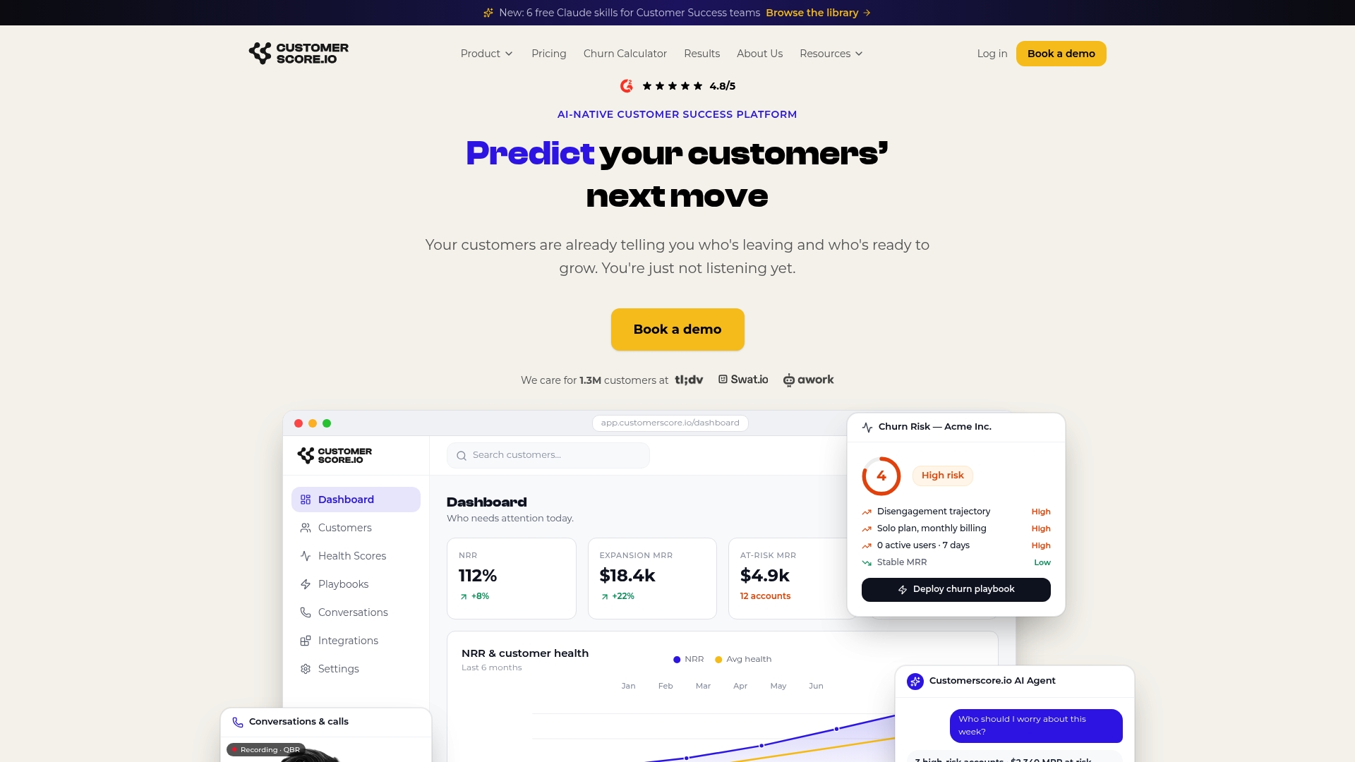
It's a sensible fit once your product analytics is producing signals but nobody has time to manually watch forty accounts' dashboards every week. Customerscore connects to tools like Mixpanel, PostHog, Segment, HubSpot, Salesforce, Stripe, and Chargebee, so the usage data you're already collecting feeds directly into churn prediction and expansion scoring rather than sitting in a separate tool nobody checks. If you're weighing it against a tool like Churnkey, the comparison breakdown covers the differences in playbook automation and scoring transparency. Book a demo and walk through what your own usage data would trigger.
Sources
For deeper technique, review the session replay guide for SaaS and Pendo's product analytics overview on capture models. Internally, churn analysis methods and the 8 retention metrics PLG teams track extend the metrics covered here.
- Quadratic is reimagining the spreadsheet with a focus on data (TechCrunch)
- Product Analytics (Pendo)
Recommended
Related articles
Best Customer Success Software for SaaS Teams in 2026
The 8 best customer success software platforms for SaaS in 2026, compared by company size and use case: health scoring, churn prediction, automation, pricing.
BlogMulti-Year Renewals in B2B SaaS: When to Offer Them and How
When a multi-year renewal pays off, what discount to expect, which clauses protect both sides, and how to time the offer.
BlogCustomer Success Org Design: Structure, Roles and CSM Capacity
How to structure a customer success team, size books by hours rather than ratios, and evolve the org as the company grows.
BlogSales to Customer Success Handoff: Template, Checklist and Other Handoffs
A one-page handoff brief, the fields it needs, timing targets, and how support to CS and product to CS handoffs work.