SaaS Retention Statistics: 8 Findings From 44,000 Users

Most churn doesn't announce itself. By the time a customer cancels, the decision was made weeks or months earlier — in the usage data, the billing setup, the number of seats. The signal was there. Nobody was looking.
To find out what those signals actually are, we analyzed structured data from 44,000 SaaS users across our customer base and network of founders. We weren't looking for averages to benchmark against — we were looking for the patterns that separate the customers who stay from the ones who quietly leave. Eight of them showed up again and again, across very different products.
Here's what the data says.
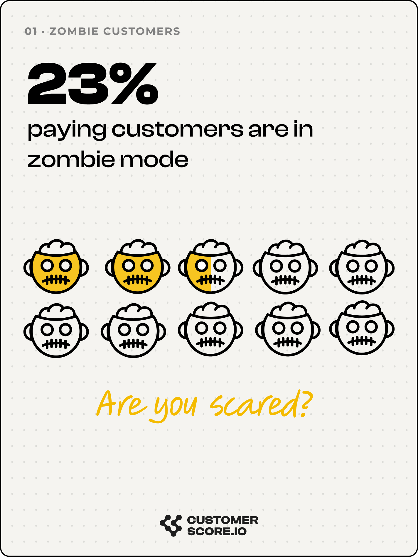
1. One in four paying customers is doing nothing
The median B2B SaaS company has 23% of its "active" customer base completely disengaged — no product activity, no value delivered, subscription paid in full.
"Active" in a billing system only means paying and not canceled. It says nothing about whether anyone is using the product. Nearly 1 in 4 customers who look healthy on the dashboard hadn't touched the product in the past 30 days — invisible to billing, obvious to a customer health score.
The range is extreme. The highest zombie rates sit above 35% — more than a third of paying customers fully checked out. The lowest approaches zero, in a product where inactivity is structurally impossible to hide (a survey platform where value is responses collected — no responses, no ambiguity).
The uncomfortable part: the companies with the highest zombie rates aren't struggling businesses. Several were among the highest-revenue in the dataset. High revenue and high disengagement coexist far more often than founders expect — because the revenue masks the rot until renewal.
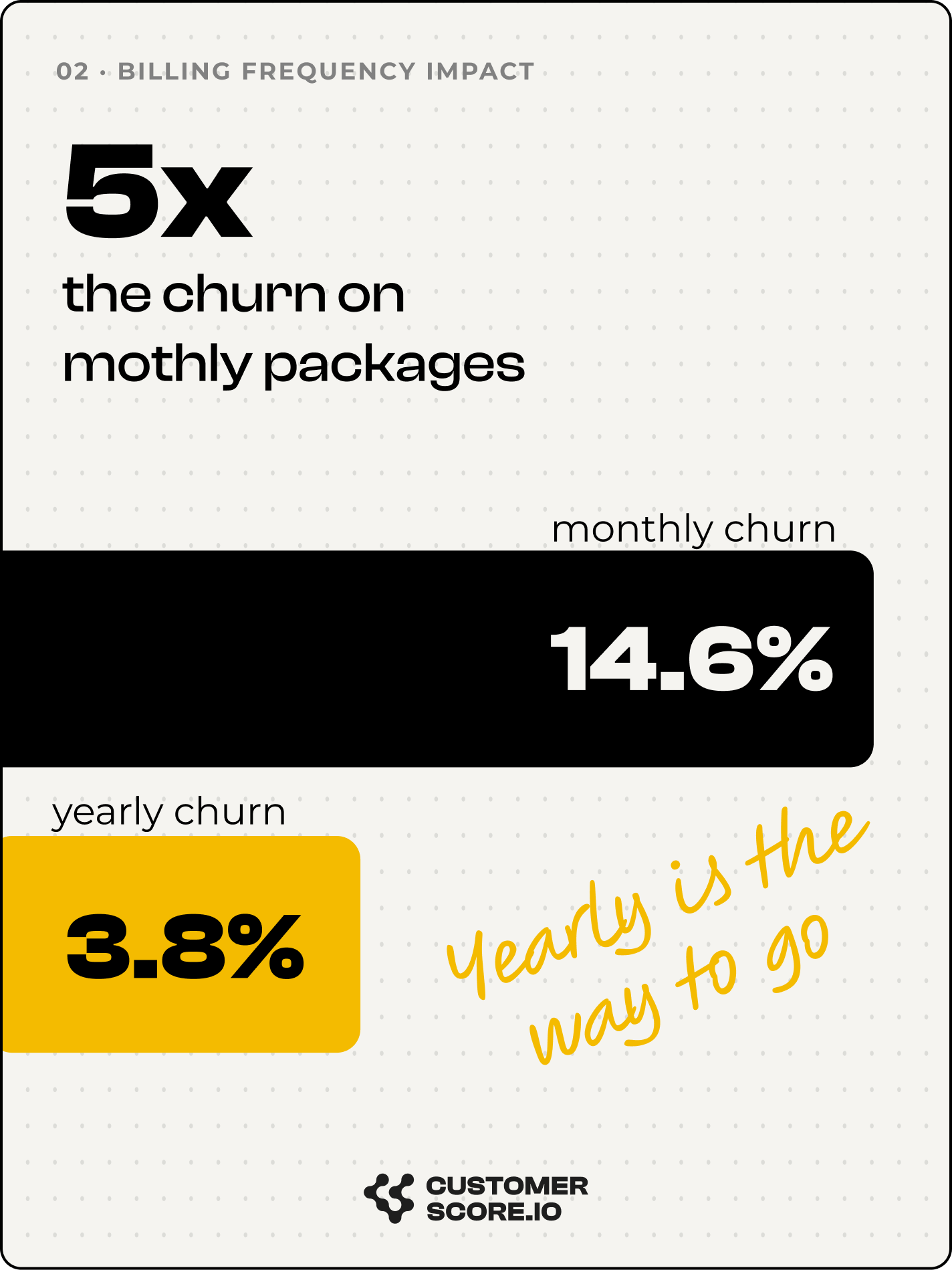
2. Monthly plans churn 4.7× faster than annual — with no exceptions
Same product, same customer type, same price per month. Change only the contract length, and the churn gap is consistent and large. The median multiplier was 4.7×, ranging from 2.5× at the low end to over 60× when monthly billing combined with disabled auto-renewal.
This isn't a satisfaction problem. Monthly billing creates 12 cancellation decision points a year; annual billing creates one. Monthly customers aren't less happy — they're just reminded more often that they have a choice. It's a decision-architecture problem, and moving engaged monthly customers to annual is as much an expansion lever as a retention one.
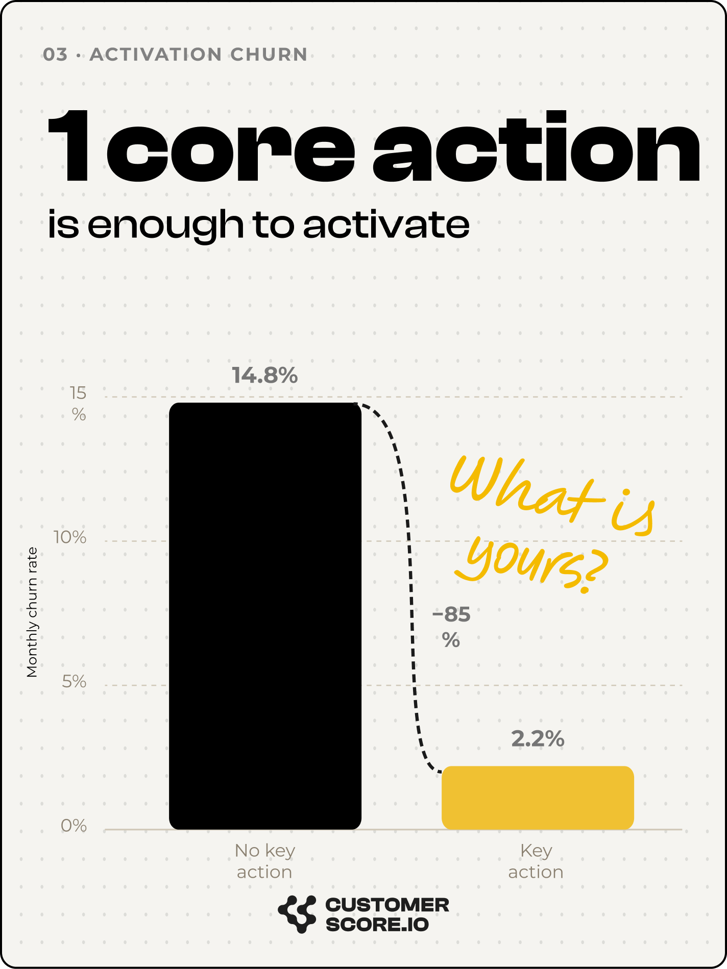
3. A single core action predicts retention
Across every product type in the dataset, there's one behavioral threshold that separates retained customers from churned ones. The action varies completely — minutes used, responses collected, tasks created, rooms booked, documents uploaded — but the shape is identical.
Customers who have never performed the core action churn at 3–6× the rate of those who have. And critically: the gap between zero and one use is larger than the gap between one use and heavy use. Teams pour effort into deepening usage when the higher-leverage intervention is getting the customer to act at all, even once.
The most striking example in the dataset: a product where zero reservations produced 14% monthly churn, and a single reservation dropped it to 0.8% — a 17× difference from one action.
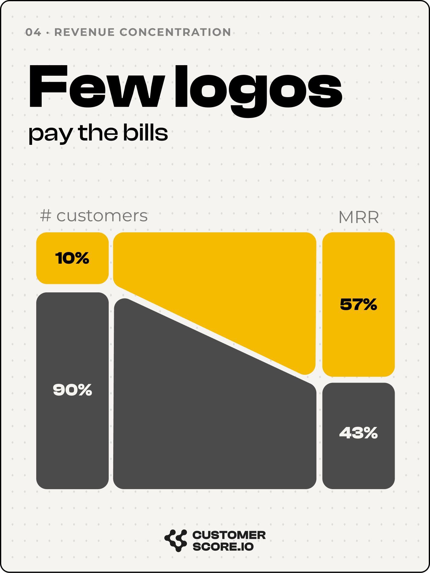
4. The top 10% of customers control 58% of revenue
Revenue concentration showed up at every scale: on average, the top 10% of customers hold 58% of MRR. Which means aggregate churn metrics systematically misrepresent business health.
A company reporting 5% monthly logo churn might be losing almost entirely from the 90% of customers who represent a minority of revenue — a manageable problem. Or it might be bleeding from the top 10% — an existential one. In aggregate metrics, the two look identical.
The practical translation: a company with 2,000 "customers" might really have 200 worth protecting and 1,800 whose churn barely registers on revenue. Teams that understand this make very different retention decisions than those who treat every logo as equal.
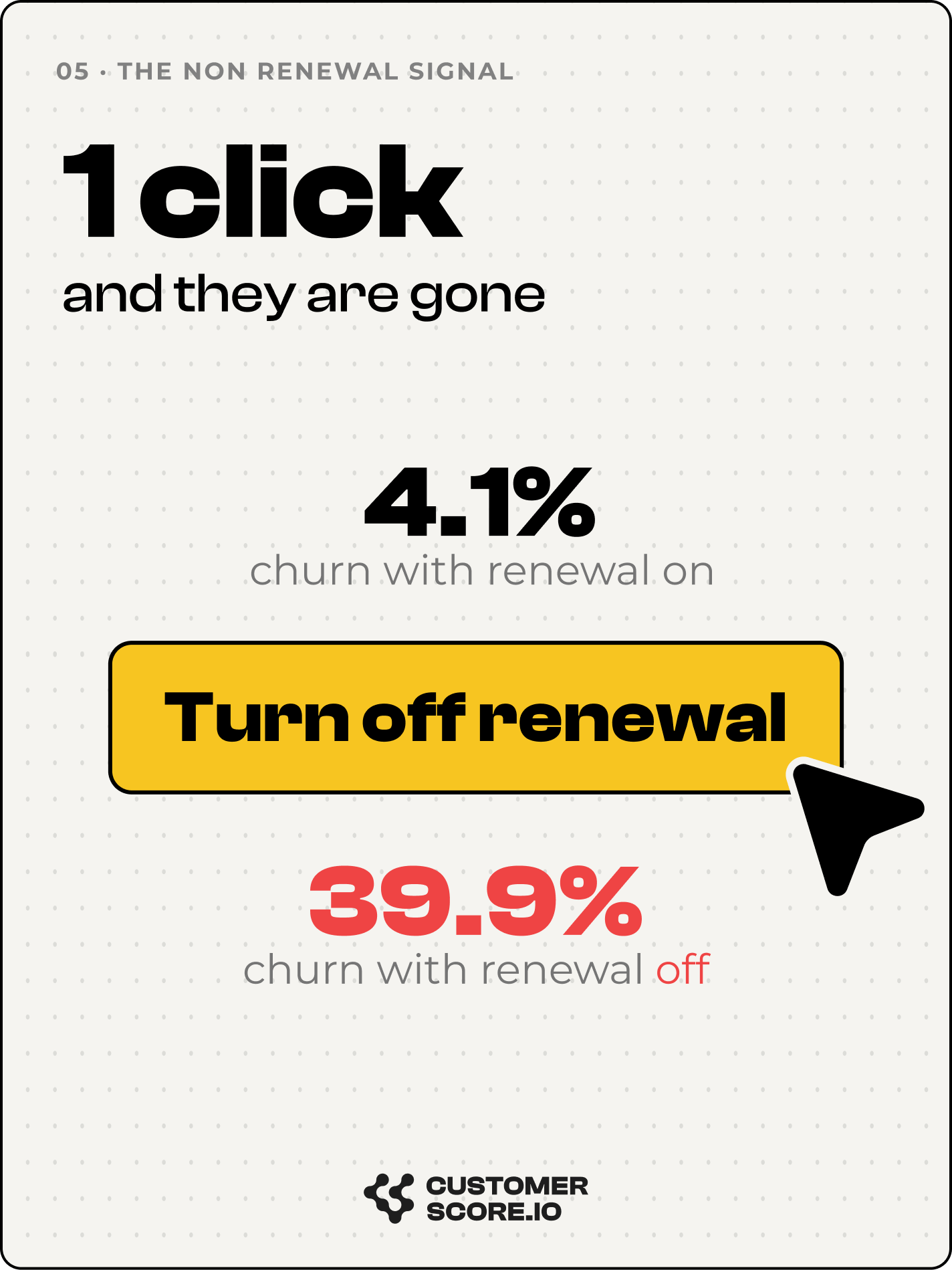
5. Non-renewal is the strongest churn signal — and the least acted on
Every billing system produces non-renewal signals: auto-renewal disabled, cancellation flagged, renewal date passed without action. Across the dataset, these were among the strongest churn predictors available — and among the least acted upon.
Once a customer signals non-renewal, the average churn rate is 40%, exceeding 90% in some cases. Even the lowest case — 22% — is 20× the base churn rate for customers without the flag. A non-renewing customer isn't a maybe; it's a near-certainty that requires active intervention to change.
The related "overdue" problem is often larger in raw count: customers whose renewal date has passed but who haven't formally churned — still billing, still "active," sitting in a gray zone most dashboards never surface. They're a leading indicator of churn that arrives without warning.
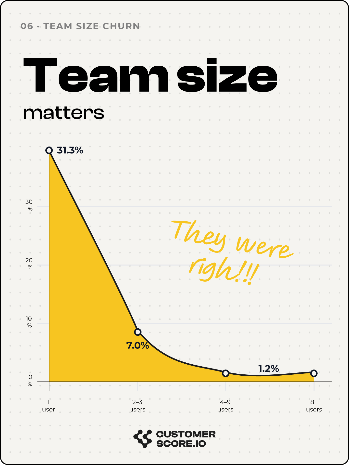
6. Single-user accounts churn 14–33× faster than teams
A single-user account is one person's preference. A multi-user account is an organizational habit. When the solo user gets distracted, changes jobs, or loses interest, the account dies instantly. When a team depends on the product, canceling requires consensus — friction no pricing or onboarding campaign can reliably manufacture.
The multiplier ran from 14× to 33× depending on category, but the direction was identical everywhere: each additional user materially lowers churn probability, with the biggest drop between 1 user and 2–3 users. Getting a second person into the account is one of the most durable retention moves available.
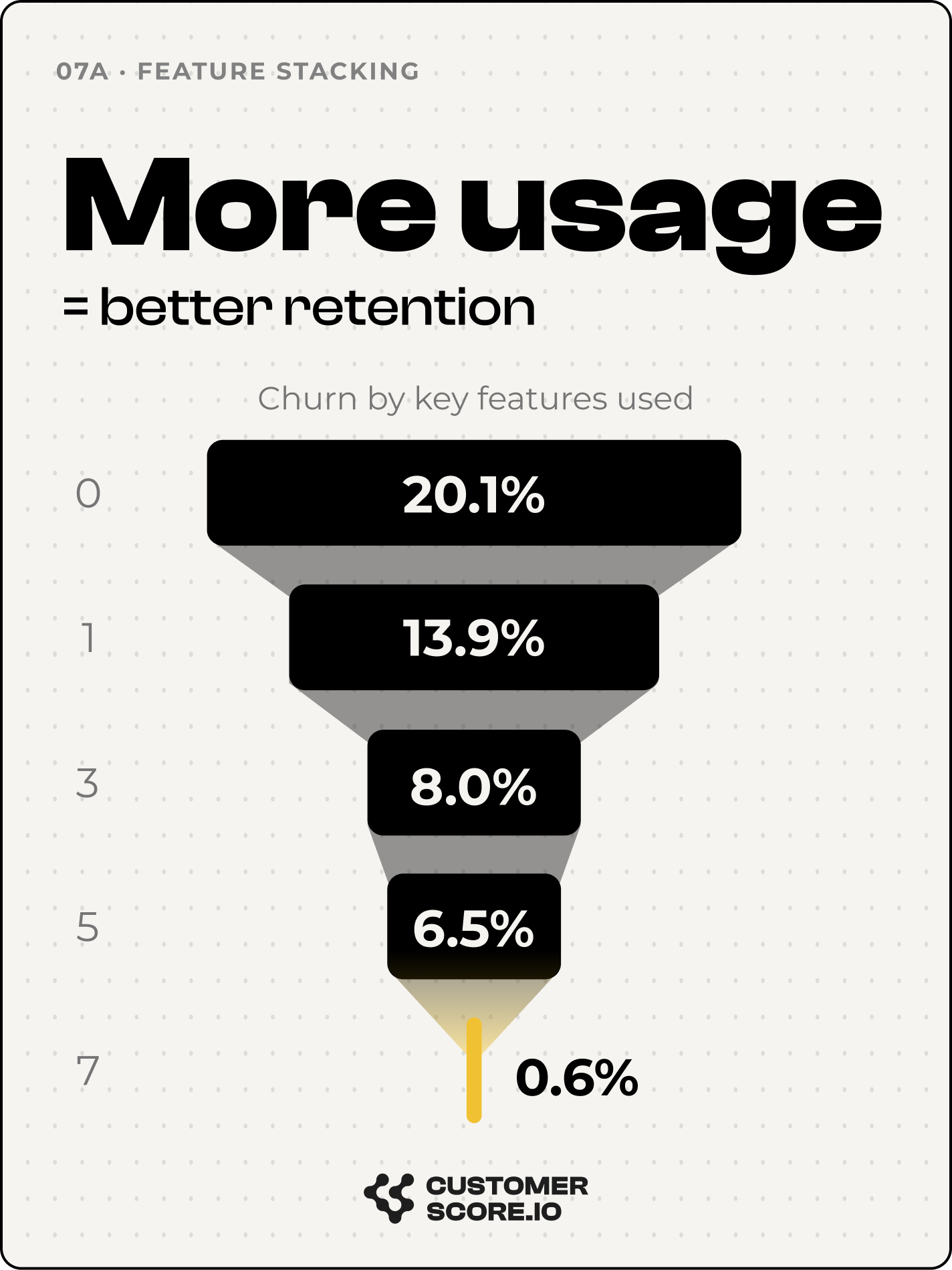
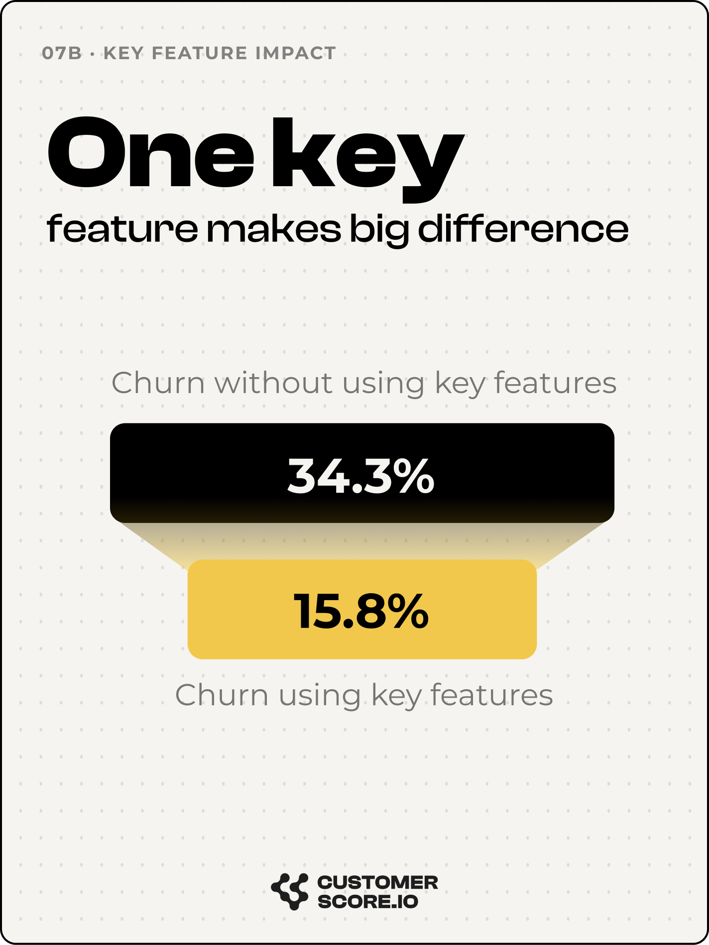
7. Feature adoption compounds — and the first feature matters most
Feature adoption showed two patterns. The first is stacking: each additional feature a customer adopts lowers churn, with the most dramatic drop between zero and one. In the clearest case — a product with 37 tracked features — moving a customer from zero to seven features produced a 97% churn reduction.
The second is individual feature impact: certain specific features show dramatically lower churn among their users, independent of total feature count. These are the features where usage is a proxy for deep workflow integration — customers who reach them rarely leave. Knowing which features those are, for your product, is worth more than a generic "drive adoption" goal.
8. Churn peaks at 6–12 months — not at onboarding
Tenure analysis revealed a consistent U-shape. Churn is elevated early (onboarding failure), dips in months 3–6 as committed customers settle in, then spikes again at 6–12 months — after the initial commitment but before habits are fully formed.
The 6–12 month median churn rate (25%) was higher than both the earliest cohort (15.7%) and later ones. This is the window where customers have been around long enough to cancel without guilt, but haven't yet built the organizational habit that makes canceling hard. It's also the window most retention programs don't target — they're still focused on the first 90 days.
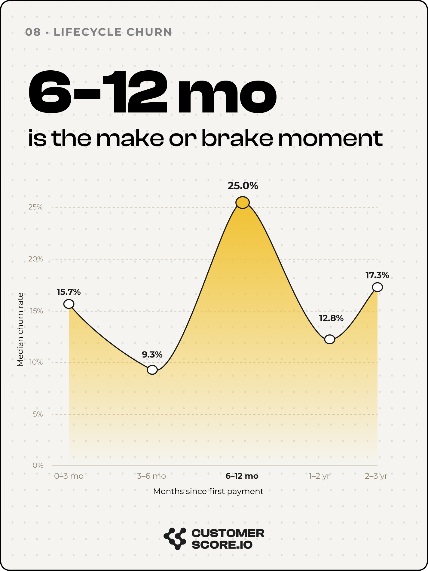
One exception worth flagging: in high-churn businesses, the pattern doesn't normalize after year one. It keeps escalating — some companies lose more customers in year two than year one, a sign that initial commitment masked an unresolved value-delivery problem.
What this means operationally
Read together, the eight patterns point at the same thing: the signals that predict churn are already sitting in your billing and usage data — disengagement, billing cadence, the unmade first action, a non-renewal flag, a lonely single seat, the unadopted feature, the 9-month cohort. They're rarely watched because no dashboard surfaces them together, and no team can monitor hundreds or thousands of accounts by hand.
That's the gap Customerscore.io is built to close: an AI-native Customer Success platform that predicts which accounts will churn or expand — and explains why — from the billing and usage data you already have, so you can act before the renewal instead of after the cancellation.
Methodology
All analysis is based on structured customer data provided directly by each participating company, covering roughly 44,000 SaaS users across multiple products and categories. Figures are reported as medians and ranges across companies; individual company data is not disclosed. Multipliers (e.g. "4.7×") compare churn rates between segments within the same product, not across the whole dataset.
Key Takeaways
- 23% of the median SaaS company's paying base is disengaged ("zombie") — paying, not using.
- Monthly plans churn ~4.7× faster than annual; up to 60× with auto-renewal off.
- A single core action cuts churn 3–6×; the zero-to-one gap beats one-to-heavy.
- The top 10% of customers hold ~58% of MRR — aggregate churn hides where it matters.
- A non-renewal flag means ~40% churn (up to 90%+) — the strongest, least-used signal.
- Single-user accounts churn 14–33× more than teams; get a second seat in.
- The biggest feature-adoption gain is zero → one; one product saw 97% churn reduction.
- Churn peaks at 6–12 months, not onboarding — most retention programs miss it.
Related articles
Churn Prediction in SaaS: How to Spot Risk Before You Lose the Customer
97% of customers churn silently. Here's how to predict it — the signals, the models, and the intervention playbook that saves accounts.
Blog8 Best Customer Success Software in 2026 (for SaaS)
Compare the 8 best customer success platforms for B2B SaaS in 2026: AI churn scoring, automation, pricing, and setup, so you pick the right fit fast.
BlogCustomer Health Score 2026: Why AI Changes Churn Prediction
A customer health score that learns from your data, flags churn risk daily, and explains why — no rules to maintain, no recalibration.
BlogGross Revenue Retention (GRR): 2026 Benchmarks and Formula
What is GRR? Learn the formula, 2026 benchmarks by ACV and ARR stage, how GRR differs from NRR, and 5 data-backed ways to improve your gross revenue retention.