
Account Health Dashboard: A B2B SaaS Guide for 2026

An account health dashboard turns scattered customer data into one at-a-glance read on who is thriving, who is at risk, and who is ready to expand. This guide covers the metrics to track, how to roll one out so your team actually uses it, and how it plugs into the workflows you already run.
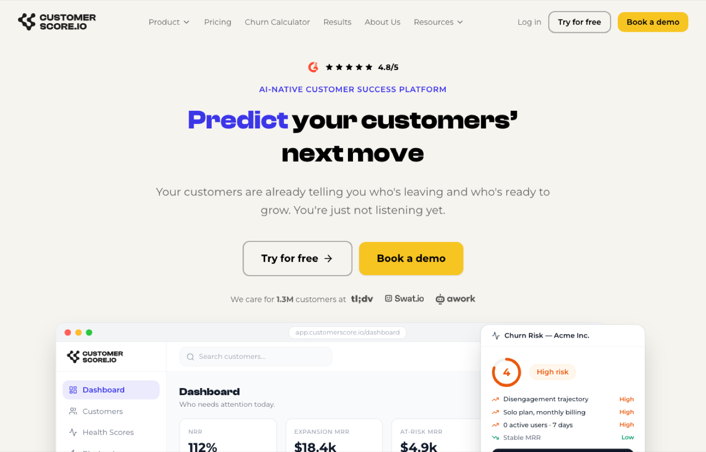
What is an account health dashboard?
An account health dashboard is a centralized visualization tool that pulls customer data from multiple sources into a single view, giving customer success managers and RevOps teams an at-a-glance read on engagement, satisfaction, and churn risk across their entire book of business.
The core purpose is early signal detection. Rather than waiting for a customer to go quiet or submit a cancellation request, your team sees the warning signs weeks in advance through tracked metrics and automated scoring.
Typical users in B2B SaaS include:
- Customer success managers monitoring individual account health and renewal risk
- RevOps leaders tracking portfolio-level trends and resource allocation
- Growth and expansion teams identifying upsell-ready accounts based on usage patterns
The data feeding these dashboards typically spans:
- Product usage logs (feature adoption, session frequency, active users)
- CRM records (contact activity, deal stage, relationship history)
- Billing data (MRR, payment history, plan changes)
- Support tickets (volume, resolution time, sentiment)
- Customer feedback signals (NPS responses, CSAT scores)
Visualization formats range from color-coded scorecards and trend charts to risk-tier lists and segment-level heatmaps. The goal is always the same: turn raw data into a decision your team can act on today.
Key metrics every account health dashboard should track
The metrics you choose define what your dashboard actually tells you. Get them right and you have a reliable early-warning system. Get them wrong and you have a beautiful chart that nobody trusts.
| Metric | What it measures | Why it matters |
|---|---|---|
| Engagement score | Email opens, clickthroughs, form submissions, scored 0 to 100 over a rolling 90-day window | Flags disengaging accounts before they churn |
| Churn rate | Percentage of customers lost in a period | Core health benchmark; below 10% is the B2B SaaS standard |
| Net Promoter Score | Likelihood to recommend, scaled 0 to 10 | Predicts advocacy and expansion potential |
| MRR growth | Month-over-month recurring revenue change per account | Tracks expansion vs. contraction at account level |
| Feature adoption rate | Percentage of purchased features actively used | Low adoption is one of the strongest churn predictors |
| Support ticket volume | Open tickets, resolution time, escalation rate | Elevated volume often precedes cancellation |
| Retention rate | Percentage of customers retained over a period | Above 90% is the target for healthy B2B SaaS businesses |
Data freshness matters as much as metric selection. A dashboard updated weekly tells a different story than one refreshed daily. Customizable date ranges let teams correlate specific campaigns or product releases with shifts in account performance, which is where the real diagnostic value lives.
Beyond individual metrics, the most effective dashboards also pull CRM linkages and marketing campaign responses to build a complete account picture. A customer who scores well on product usage but has gone silent on every marketing touchpoint is a different kind of risk than one who engages heavily but files three support tickets a week.
Why account health dashboards pay off for CS and RevOps teams
The business case for a health monitoring dashboard comes down to one shift: from reactive to proactive. Teams that wait for customers to raise their hand before intervening consistently lose accounts that could have been saved.
Key benefits include:
- Early churn detection before customers reach the point of no return
- Resource prioritization so CSMs focus time on accounts that need attention, not just the loudest ones
- Cross-functional alignment between CS, sales, and product around a shared account view
- Expansion identification by surfacing accounts with high health scores and room to grow
- Renewal confidence through data-backed conversations instead of gut-feel check-ins
The retention benchmark to know: B2B SaaS companies with strong account management practices typically hold client retention above 90% and Net Promoter Scores of 70 or higher. Dashboards that surface the right signals are a core reason those numbers hold.
Proactive management through account health dashboards directly guides resource prioritization and aligns CS efforts to strategic retention goals. That alignment matters most at scale, when a CSM is carrying 50 or 100 accounts and cannot afford to treat every customer the same way.
Best practices for implementing a health dashboard that actually gets used
A dashboard nobody trusts is worse than no dashboard at all. Implementation failures almost always trace back to the same three mistakes: too many metrics, poor data quality, and no change management plan.
Pro tip: Internal team confidence is an often-overlooked multiplier for retention program success. Before rolling out a new dashboard, measure how confident your CSMs actually feel about the data they are working with. Low confidence leads to workarounds and ignored alerts, no matter how good the underlying model is.
Practical steps for a successful rollout:
- Start with five or fewer core metrics. Complexity kills adoption. Add metrics only after the team trusts the baseline view.
- Audit your data sources first. A health score built on incomplete CRM data or lagging billing syncs will generate false signals and erode trust fast.
- Define what "healthy" looks like before you build. Set explicit thresholds for green, yellow, and red status by customer tier or segment.
- Establish a review cadence. Weekly for high-risk accounts, monthly for stable ones. Without a cadence, dashboards become wallpaper.
- Run a training session, not just a demo. CSMs need to understand how scores are calculated to act on them with confidence.
- Assign dashboard ownership. Someone on the RevOps or CS ops side needs to own data quality and threshold updates as the business evolves.
Explore SaaS retention metrics beyond churn to build a richer, more defensible health model from the start.
How account health dashboards fit into your existing B2B SaaS workflows
A dashboard that lives in isolation from your CRM, billing system, and support platform is just a reporting tool. The real value comes when it feeds directly into the workflows your team already runs.
Integration points that matter most:
- CRM (HubSpot, Salesforce): Sync account health scores into contact and deal records so sales and CS work from the same data
- Billing platforms (Stripe, Chargebee): Pull MRR, payment history, and plan changes to catch contraction signals early
- Product analytics (Mixpanel, PostHog, Segment): Feed feature adoption and session data into engagement scoring
- Support tools (Intercom): Surface ticket volume and sentiment alongside usage data for a complete risk picture
- Alerting (Slack): Push alerts when an account crosses a risk threshold, so CSMs act within hours, not weeks
When CS, RevOps, and product teams all operate from a unified account view, the conversation shifts from "who owns this account?" to "what does this account need next?" That shift is where retention programs actually start working.
The integration of CRM, billing, and support platforms with alerts and playbooks is what separates a functional dashboard from a genuinely proactive customer success operation. Without that connectivity, you are still reacting. With it, your team can intervene at exactly the right moment in the customer lifecycle, whether that is a renewal conversation, an expansion play, or a save motion on an at-risk account.
For RevOps teams specifically, a unified data view also simplifies forecasting. When health scores feed into your renewal pipeline, you can model retention revenue with far more precision than a spreadsheet allows. See how RevOps workflows can be built around health data for cleaner forecasting and better cross-team alignment.
Why Customerscore.io stands out for account health scoring in B2B SaaS
Most health dashboards show you what happened. Customerscore.io tells you what is likely to happen next, and why.
The platform's AI-driven health scoring pulls from billing, product usage, CRM, and support data simultaneously, then surfaces explainable scores your CSMs can actually act on. No black-box outputs. No "the model says so." Each score comes with the specific signals driving it.
Key capabilities that set Customerscore.io apart:
- Automated churn prediction that flags at-risk accounts before the customer signals intent to leave
- Explainable health scores so CSMs understand the "why" behind every rating
- Multi-source data integration across Stripe, Chargebee, HubSpot, Salesforce, Mixpanel, PostHog, Segment, and Intercom
- Actionable playbooks triggered by health score changes, so the right intervention happens automatically
- Real-time Slack alerts when accounts cross risk thresholds
- MCP and AI agent support for teams building next-generation CS workflows
Pro tip: Use segment-level views to build separate health models for your enterprise, mid-market, and SMB tiers. A single threshold that works for a $50K ARR account will misfire on a $5K one.
Customizing your dashboard for different customer segments and tiers
A single health model applied uniformly across your entire customer base will generate noise. Enterprise accounts behave differently from SMB customers, and a score calibrated for one tier will misread the other.
Effective segmentation starts with acknowledging that "healthy" means different things depending on contract size, product complexity, and expected usage patterns. An SMB customer logging in twice a week might be perfectly healthy. An enterprise account with the same frequency is probably at risk.
Practical customization approaches:
- Tier-based thresholds: Set separate green/yellow/red cutoffs for enterprise, mid-market, and SMB segments based on historical churn data for each group
- Weighted metric models: Give feature adoption more weight for product-led accounts; weight relationship activity higher for high-touch enterprise customers
- Segment-specific playbooks: Trigger different intervention workflows depending on the customer tier, not just the health score
- Lifecycle stage adjustments: New customers in onboarding should be scored differently than accounts in their third renewal cycle
- Industry or use-case filters: Customers using your product for different jobs-to-be-done may show different usage patterns that a single model would misinterpret
The goal is a dashboard that reflects how each segment actually behaves, not how you wish they all behaved.
Customerscore.io gives your CS team a daily view of every account
Knowing which accounts need attention right now, and which are primed for expansion, is the difference between a CS team that hits retention targets and one that spends every quarter in firefighting mode.
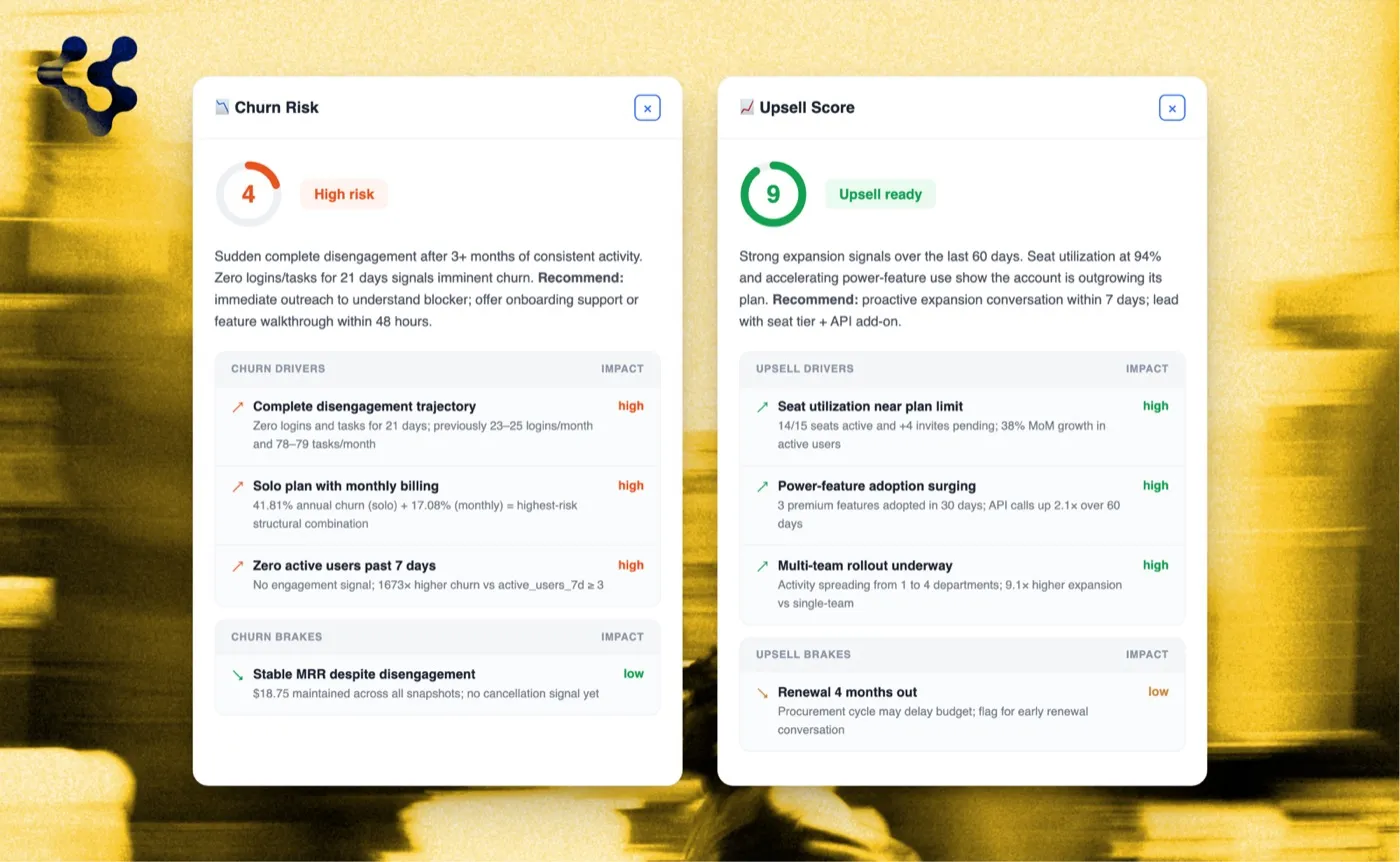
Customerscore.io is built specifically for B2B SaaS customer success and RevOps teams who need more than a static spreadsheet or a basic CRM health field. The platform connects your billing, product, CRM, and support data into two scores for every account, refreshed daily: a Churn Risk Score and an Upsell Score from 1 to 5, each with the drivers and brakes behind it. Your team sees who needs attention and why, before an account goes cold.
You get churn prediction that explains itself, segment-level views for enterprise and SMB accounts, and direct integrations with HubSpot, Salesforce, Stripe, and Intercom. No months-long implementation. No per-seat pricing that penalizes growth. Most teams are live within 1 to 3 weeks.
If you are managing renewals, expansion, or a growing book of accounts and want to see what proactive retention actually looks like in practice, book a demo and see it live.
Key takeaways
An account health dashboard is only as valuable as the metrics it tracks, the data quality behind it, and the workflows it feeds into.
| Point | Details |
|---|---|
| Core purpose | Centralizes customer data into a single view to detect churn risk before customers signal intent to leave. |
| Retention benchmark | B2B SaaS companies with strong account management typically hold retention above 90% and NPS of 70 or higher. |
| Implementation priority | Start with five or fewer metrics and audit data sources before building; complexity and poor data quality kill adoption. |
| Segmentation requirement | Apply separate health thresholds and playbooks for enterprise, mid-market, and SMB tiers to avoid false signals. |
| Customerscore.io | Provides AI-driven, explainable health scoring with multi-source integration and automated playbooks for B2B SaaS CS and RevOps teams. |
Related reading
Related articles
How to Build a Customer Health Score in HubSpot (Step by Step)
A step-by-step guide to building a customer health score in HubSpot, from a manual RAG score to weighted workflows, how to bring in product usage, and the pitfalls to watch.
BlogBest Churn Prediction Software (2026)
The best churn prediction software in 2026, compared on what matters: how each tool predicts churn, whether it explains the why, reads product usage, and turns the risk into work for your team.
Blog8 Best Customer Health Score Software Tools (2026)
The 8 best customer health score tools in 2026, compared on how they actually score health: configured vs predicted, churn and expansion, setup time, and admin effort.
BlogChurn Prediction in SaaS: How to Spot Risk Before You Lose the Customer
Most churning customers show warning signs 30+ days before they cancel. The signals, the prediction methods, and the playbooks that turn a flag into a save.