
60 to 120 Day Lead Time: Early Churn Warning for B2B SaaS


An early churn warning is any measurable signal that a customer is disengaging weeks or months before they cancel or fail to renew. The first move is not building a model. It's picking four to six of those signals, weighting them into a single health score, and wiring that score to a playbook. Teams that do this typically buy themselves several weeks to a few months of lead time and materially improve how many at-risk accounts they save.
TL;DR:
- Most early churn signals appear through declining product usage, such as drops in login frequency, feature use, or session duration, often 60 to 120 days before cancellation.
- Relationship signals like a departed champion or no-shows at meetings are strong early predictors, especially when combined with support or billing friction indicators.
- Implementing a simple weighted score based on five to six signals and ranking accounts by risk provides more actionable insight than complex machine learning models for small to medium customer bases.
- A tiered approach to intervention, from automated re-engagement for yellow risks to personalized outreach for red risks, increases the chances of account retention.
- Measuring key metrics such as detection lead time, false positives, and save rate is essential to validate and improve the effectiveness of early warning systems.
Table of Contents
- Core Signal Categories That Actually Predict Churn
- Instrumenting Data and Building a Retention Dashboard
- The Operating Sequence: Define, Instrument, Score, Monitor, Triage, Save, Learn
- What to Actually Do at Each Risk Tier
- Metrics That Prove Your Warning System Works
- Scaling Without Drowning Your Team in Alerts
- Customerscore.io's Approach to Explainable Health Scoring
- Handling Customer Data Responsibly While Monitoring Risk
- What Working Implementations Look Like
- Author Perspective: What Actually Changes When This Works
- Get From Detection to Automated Saves With Customerscore
- Sources
- FAQ
Core Signal Categories That Actually Predict Churn
Most churn doesn't happen suddenly. It shows up as a pattern across four categories, and the earliest signals almost always come from product usage rather than the support queue or the invoice. Declining usage, a departed champion, unresolved tickets, and billing friction typically surface weeks or months before a cancellation notice ever hits your inbox, according to research from Pulse RevOps. With proper instrumentation, some teams flag risk 60 to 120 days out, and usage decline tends to be the first domino to fall.
Product and behavioral signals are the leading indicators:
- Login frequency dropping below the account's own baseline
- Shrinking feature breadth (a customer who used 8 features now touches 2)
- Falling session duration or session count per week
- API call volume trending down over a rolling 30-day window
Relationship signals tell you who's still in the room:
- Champion goes quiet or changes roles without a documented handoff
- Executive sponsor departs the company (one of the strongest single predictors, according to SaasDash)
- QBR no-shows or repeated rescheduling
Support and sentiment signals reveal friction building up:
- Ticket volume spiking, or the opposite: total silence
- Repeated tickets on the same unresolved issue
- Data export requests or API pulls that look like a migration prep
Commercial and billing signals are the loudest but latest warning:
- Billing page visits, with three or more in a 30-day window often preceding cancellation, per SaasDash's analysis
- Failed payments or repeated card declines
- Downgrade requests or invoice disputes
One pattern deserves special attention: the "silence signal," where logins, email opens, and support tickets all go quiet at once. That combination often signals higher risk than a slow, gradual decline, because it usually means the account has already mentally checked out and is just waiting for the renewal date.
Instrumenting Data and Building a Retention Dashboard
You don't need a data warehouse to start. You need five sources feeding one view, and a dashboard that ranks accounts by urgency instead of just displaying charts.
Pull from these primary sources:
- Product telemetry (Mixpanel, PostHog, Segment, or your own event pipeline) for usage recency, frequency, and feature breadth
- Billing data (Stripe, Chargebee) for payment failures, downgrade attempts, and plan changes
- CRM records (HubSpot, Salesforce) for champion and sponsor contact history, renewal dates, and deal notes
- Support platforms (Intercom or your helpdesk) for ticket volume, sentiment, and resolution time
- Email and communication data for open rates and meeting attendance, which often catch relationship decay before anything else does
A retention dashboard that combines product events, billing, CRM, and support data, then focuses on the handful of KPIs that actually drive action, beats a dashboard packed with vanity metrics, according to guidance from Sigma Computing. At minimum, track recency of last login, frequency of use over 30 days, feature breadth, support sentiment trend, billing flag status, and whether a named champion is still active.
On the rules-versus-machine-learning question: if you're under roughly 500 to 1,000 customers, a weighted scoring model will outperform an early machine learning model on speed and debuggability, according to Skene's research. Machine learning earns its keep once you have enough historical data and feature richness to train on, and Microsoft's guidance on subscription churn modeling recommends two to three years of historical data before that shift makes sense.
For visualization, skip the pie charts. What works is a ranked list sorted by risk score, with trend sparklines showing directional movement and a lead-time column. Dashboards that rank accounts by how many days remain before predicted churn help teams with limited capacity decide who to call first, a pattern confirmed by Sigma Computing's analysis of retention dashboard design.
The Operating Sequence: Define, Instrument, Score, Monitor, Triage, Save, Learn
Turning signals into action requires a repeatable sequence, not a one-time project.
- Define the outcome you're predicting (cancellation, downgrade, or non-renewal) and the window (30, 60, or 90 days out).
- Instrument four to six signals across the categories above. More isn't better here. A tight, well-chosen set beats a sprawling one nobody can debug.
- Score each signal, weight it, and sum into a composite. Start weights based on judgment, then correct them.
- Monitor the score continuously, not on a monthly report cycle.
- Triage accounts into tiers (green, yellow, red) and route each tier to a defined owner.
- Save with the playbook action tied to that tier.
- Learn by tracking whether the intervention worked, and feed that back into your weights.
To calibrate weights instead of guessing, score your last 30 to 50 churned accounts retroactively and see which signals fired first and how early, a method Pulse RevOps recommends before turning on automation. That retroactive pass tells you which signals are noise and which ones actually lead the churn event.
Typical score bands look like this: green (0 to 39 points) means healthy, no action needed; yellow (40 to 69) triggers automated nudges and a CSM check-in; red (70+) triggers immediate human outreach and often executive involvement for strategic accounts. Your exact ranges will shift once you calibrate against real churned accounts.
Pro Tip: *Cap your alert volume before you launch.
What to Actually Do at Each Risk Tier
A score without a paired action is just a number. The playbook is where the score earns its budget.
Yellow tier calls for low-cost, scalable moves: automated re-engagement emails referencing the specific feature they've stopped using, in-app flows nudging toward an underused capability, or a short educational sequence tied to their original use case. No human touch required yet.
Red (high) tier needs a person. That means personalized CSM outreach referencing the actual signal (a champion change, a failed payment, a support escalation), a technical troubleshooting session if the friction is product-related, and internal alignment with sales or the account executive on renewal risk.
Critical tier for strategic accounts goes further: executive-to-executive outreach, a tailored offer or contract adjustment, and sometimes short-term hands-on services to unblock whatever is stalling adoption. This tier is expensive to run, so reserve it for accounts where the revenue at risk justifies it.
- Don't skip the measurement step. Run playbook actions as controlled experiments where possible, holding out a small comparison group.
- Track save rate by intervention timing, not just overall.
- Retire playbook actions that don't move the needle after two or three cycles.
Pro Tip: Timing beats creativity. Intervening well before renewal produces a save rate substantially higher than waiting until the last week, according to SaasDash's data. The best-written outreach email sent too late still loses.
Metrics That Prove Your Warning System Works
A health score that never gets measured against outcomes is just decoration. Four metrics separate a working program from a guess.
| Metric | What it tells you |
|---|---|
| Lead time to detection | How many days before cancellation the score flagged risk |
| Detection rate | Percentage of actual churns the score caught before they happened |
| False positive rate | Percentage of flagged accounts that were actually healthy |
| Save rate | Percentage of flagged at-risk accounts retained after intervention |
Score-based systems that catch risk during the four to twelve week decay window can save 30 to 50% of at-risk accounts, according to Skene's findings, which gives you a realistic benchmark to compare against. Validate your score with a holdout test: hold back a portion of accounts from any automated intervention and compare their churn rate against the treated group. If there's no meaningful gap, your playbook isn't working, regardless of how the score performs on paper.
For reporting to RevOps and finance, translate saves into retained annual recurring revenue, not just account counts. A churn-to-revenue calculator makes that translation concrete instead of abstract.
Scaling Without Drowning Your Team in Alerts
Most teams move through three maturity stages. Stage one (roughly the first 30 days) is manual: a spreadsheet, five signals, weekly review. Stage two (days 30 to 90) automates alert routing and adds a real dashboard. Stage three (90 days and beyond) introduces machine learning refinement and expands signal coverage once data volume supports it.
Governance matters more than tooling here. Assign a single owner for the scoring model, a monthly calibration cadence, and a clear data steward for each source feeding the score.
Three pitfalls sink most first attempts:
- Overfitting to past churns. A model tuned entirely on last year's cancellations can miss a new churn pattern entirely.
- Thresholds set too sensitive. If half your book is flagged red, nobody trusts the system, and CSMs start tuning it out.
- No clear alert ownership. An alert that lands in a shared inbox with no named owner is an alert that never gets worked.
A 90-day pilot checklist: pick one segment, instrument five signals, retroactively score 30 past churns, set initial thresholds, assign one owner per tier, and measure save rate weekly. Adjust weights at day 45 and again at day 90.
Customerscore.io's Approach to Explainable Health Scoring
Customerscore builds this entire sequence into a connected platform rather than a spreadsheet stitched together by hand. The AI-native scoring model pulls from product usage, billing, CRM, and support data, and produces a health score with a visible breakdown of exactly which signals drove it up or down. That transparency matters, because a CSM who can't explain why an account is red can't act on it with confidence.
Teams evaluating this space can go deeper with a few practical resources:
- A breakdown of churn prediction signals specific to SaaS
- Guidance on building an account health dashboard
- A framework for reducing churn in self-service products
- Methods for analyzing churn patterns retroactively
Handling Customer Data Responsibly While Monitoring Risk
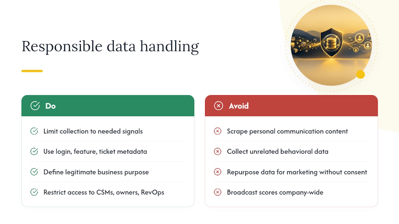
Tracking behavioral signals means touching sensitive account and usage data, and doing that carelessly creates legal exposure and erodes trust faster than churn ever will. Start by limiting collection to what the score actually needs. Login timestamps, feature usage, and support ticket metadata earn their place; scraping personal communication content or unrelated behavioral data does not.
Be explicit internally about what counts as a legitimate business purpose. Monitoring product usage to improve retention and support is defensible under most data protection frameworks, including GDPR's legitimate interest provisions, but that defense weakens if the data gets repurposed for unrelated marketing without consent.
Access control matters as much as collection scope. Health scores and the raw signals behind them should be visible to the people who act on them (CSMs, account owners, RevOps) and not broadcast company wide as a scoreboard. That also protects customers from having sensitive billing or support friction data treated as casual gossip.
Document your retention policy for behavioral data. Signals feeding a churn score don't need indefinite storage. A rolling 12 to 24 month window is usually enough to support both scoring and retroactive calibration, without accumulating data you can't justify keeping.
Finally, build a clear internal answer to "why is this account flagged." Customers occasionally ask what triggered an outreach, especially in regulated industries, and an explainable score with a visible list of contributing signals is a much stronger position than a black box you can't unpack under pressure.
What Working Implementations Look Like
The teams that get real lead time from an early warning system share a pattern: they start narrow, prove the save rate, then expand. A mid-market SaaS company running a health score across usage recency, feature breadth, and billing flags for a segment of 200 accounts can typically validate a working model within a single quarter, since the retroactive scoring pass on past churns gives an immediate read on which signals actually fire early.
The common failure mode isn't a bad model. It's launching across the entire customer base at once with unvalidated weights, generating a flood of yellow and red flags that CSMs can't triage, and abandoning the system within two months because it created more noise than signal. Teams that instead pilot on one segment, one product line, or one ARR band, calibrate against 30 to 50 historical churns before automating anything, and only then widen scope, tend to see the save-rate gains materialize and stick.
The other consistent thread: cross-functional buy-in. A health score that lives only in the CS team's dashboard rarely survives contact with a renewal in trouble, because sales, support, and product all hold pieces of the picture the score needs. Programs that route red-tier alerts to a shared channel involving the account executive, not just the CSM, close more saves than ones that keep the alert siloed.
Author Perspective: What Actually Changes When This Works
Most early-warning failures aren't technical. They fail because ownership sits with one person and nobody upstream treats the alert as urgent. Prioritize a small, measurable pilot over months of data collection. Pick five signals, score last quarter's churns, and see what fires. You'll learn more in that one exercise than in a year of "gathering more data first."
— Patrik
Get From Detection to Automated Saves With Customerscore
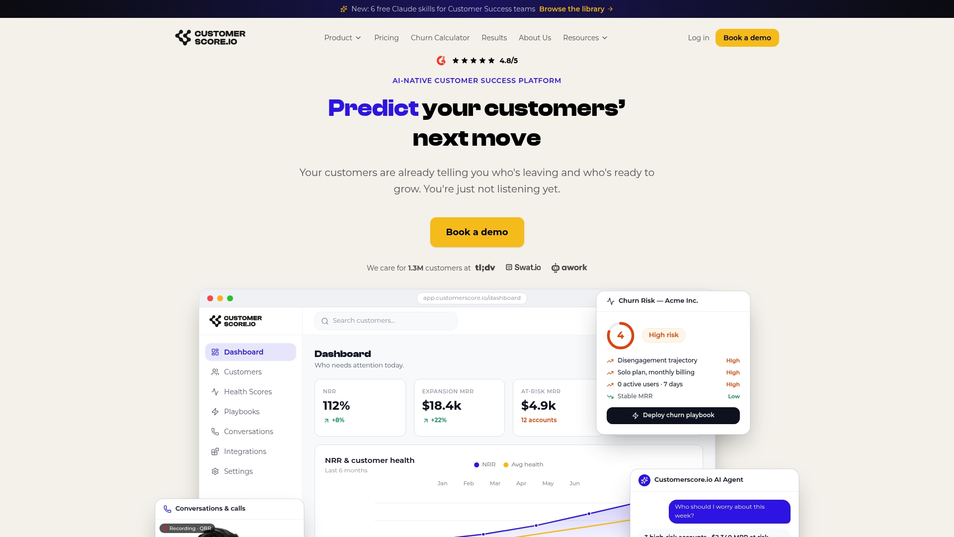
There are platforms that provide AI-native health scoring engines connecting billing, product usage, CRM, and support data into one explainable score, with deployment times that can be days rather than the months a homegrown model usually takes. Every score comes with a visible breakdown of which signals drove it, so your CSMs know exactly why an account went yellow or red and what playbook to run next.
If you're weighing building this in-house against buying it, the honest answer is: build it if you have a data team with bandwidth to maintain pipelines indefinitely, buy it if you want the scoring, alerting, and playbook automation live before your next renewal wave hits. Compare plan options or look at the churn prediction product directly to see how the scoring and alerts work end to end. Ready to see it against your own account data? Book a demo and bring your last quarter's churned accounts.
Sources
- Building a Churn Early-Warning System | Pulse RevOps
- Churn prediction for SaaS: how to spot at-risk accounts before they leave | Skene
- How To Predict Customer Churn With A Simple BI Dashboard
- Saasdash
FAQ
What does churn mean in simple terms?
Churn is the rate at which customers cancel or fail to renew over a given period, usually expressed as a percentage of the customer base lost. In B2B SaaS, it's typically measured monthly or annually against active accounts at the start of that period.
What is a churn risk?
A churn risk is an account showing one or more early warning signals, like declining usage, a departed champion, or billing friction, that statistically correlate with future cancellation. Flagging churn risk early, sometimes 60 to 120 days before renewal according to Pulse RevOps, gives teams time to intervene before the decision is final.
What does 10% churn mean?
A 10% churn rate means 10 out of every 100 customers canceled or didn't renew during the measured period. Whether that's healthy depends heavily on your segment and contract length. Annual churn above 10% is a concern for most mid-market B2B SaaS companies, while monthly churn near that level would be alarming.
What does churn prediction mean?
Churn prediction is the practice of using historical customer data, usage patterns, billing history, and support interactions to estimate the probability that a specific account will cancel. It ranges from a simple weighted scoring model, which platforms like Customerscore use for explainable scoring, to statistical and machine learning approaches like logistic regression or survival analysis, as outlined in Amplitude's guide to churn prediction.
Recommended
Related articles
Cut CSM Intervention 18%: Predictive Playbooks for CS & RevOps
Cut CSM Intervention 18%: Predictive Playbooks for CS & RevOps ! Predictive playbook geometric title card Predictive playbooks link a churn prediction to a specific, repeatable action so customer
BlogPinpoint B2B SaaS Adoption Gaps and the Fix That Lifts Renewal
Pinpoint B2B SaaS Adoption Gaps and the Fix That Lifts Renewal ! Analysts reviewing SaaS adoption gaps Adoption gap analysis identifies the funnel stage where eligible users or accounts fail to reach
BlogAnalysts: 6–12 Month Cohort Forecasts for Net Dollar Retention
Analysts: 6–12 Month Cohort Forecasts for Net Dollar Retention ! Analyst reviewing cohort retention forecast The most reliable way to forecast net dollar retention is cohort-based modeling that
BlogStop Surprise Churn: 5 Phase Data Mapping for RevOps and CS
Stop Surprise Churn: 5 Phase Data Mapping for RevOps and CS ! Analyst mapping customer data fields Data mapping for CS means connecting product usage, billing, CRM, and support data to the fields your