
Customer Success Metrics: The B2B SaaS Practitioner's Guide


Track three metric groups and you have the foundation of a defensible customer success program: revenue and retention (NRR, GRR, churn rate, CLV, CRC, renewal rate), product health and adoption (health score, adoption rate, DAU/MAU, time-to-value, feature adoption), and satisfaction and sentiment (NPS, CSAT, CES). The immediate action is to pick one metric from each group, assign an owner, and write a playbook that fires when that metric moves. Measuring without a pre-defined response is the most common and expensive mistake CS teams make.
The six metrics most CS leaders prioritize first:
- Net Revenue Retention (NRR) — the headline metric for leadership; captures expansion and contraction in one number
- Gross Revenue Retention (GRR) — isolates pure retention, no expansion noise
- Customer health score — composite leading indicator that predicts renewal risk weeks in advance
- Product adoption rate — tells you whether customers are actually using what they paid for
- NPS — relationship-level sentiment, reviewed quarterly
- Customer Effort Score (CES) — predicts churn faster than satisfaction alone in high-friction workflows
Cadence rule: review leading indicators (health score trajectory, feature adoption, CES) weekly or monthly. Review lagging indicators (NRR, CLV, GRR) quarterly. Mixing those cadences is where most dashboards break down.
Table of Contents
- What customer success metrics actually measure (and how they differ from support metrics)
- Revenue and retention metrics: formulas, cadence, and playbook triggers
- Product health and adoption metrics: what usage data actually tells you
- NPS, CSAT, and CES: which satisfaction metric to use and when
- How to build a customer health score that CSMs actually trust
- Operationalizing metrics: cadence, dashboards, and two sample playbooks
- How to set benchmarks and targets that actually mean something
- Common measurement mistakes that quietly destroy CS programs
- Key Takeaways
- The metric that changed how I think about CS programs
- Customerscore turns these metrics into automated action
- Useful sources and further reading
What customer success metrics actually measure (and how they differ from support metrics)
Customer success metrics measure whether customers are achieving the outcomes they bought your product to reach. That is the entire definition. Everything else follows from it.

The distinction that matters in practice is outcome metrics vs. activity metrics. An outcome metric answers "did the customer get value?" A renewal, an expansion, a health score moving from yellow to green — those are outcomes. An activity metric answers "what did the team do?" Number of outreach emails sent, QBRs completed, tickets resolved — those are activities. Both have a place, but confusing them is how CS programs end up reporting busy-ness instead of impact.
A concrete example: a CSM sends 40 check-in emails in a quarter (activity). The customer still churns. The activity metric looked fine; the outcome metric told the real story. Grouping metrics into revenue, product health, and sentiment makes it easier to build dashboards that leaders trust and that CS teams can actually act on.
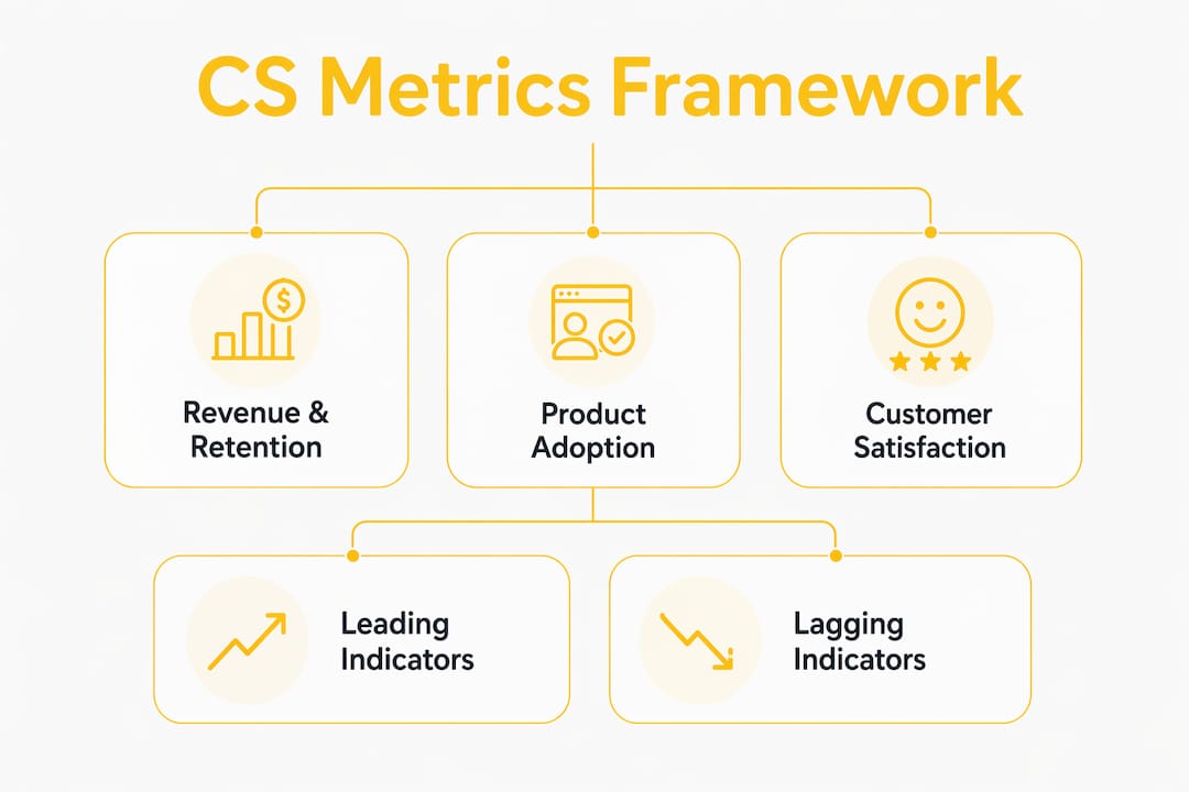
B2B SaaS needs both leading and lagging indicators to be actionable. Lagging indicators like NRR and CLV confirm what already happened. Leading indicators like feature adoption rate and health score trajectory give you enough runway to intervene before the renewal conversation. Neither type alone is sufficient. A team watching only NRR is always reacting; a team watching only health scores without tying them to revenue impact can't prove ROI to the CFO.
Revenue and retention metrics: formulas, cadence, and playbook triggers
These are the metrics that show up in board decks. They are lagging by nature, which means the signals that feed them need to be monitored upstream, but they are also the numbers that prove whether the CS function is protecting and growing revenue.
The core six and how to calculate them
Net Revenue Retention (NRR) measures the percentage of recurring revenue retained from existing customers after accounting for expansions, contractions, and churn. Formula:
NRR = ((Starting MRR + Expansion MRR − Contraction MRR − Churned MRR) ÷ Starting MRR) × 100
A company starting a quarter at $500K MRR, adding $60K in expansion, losing $20K in downgrades, and churning $15K comes out at 105% NRR. Anything above 100% means the existing base is growing without new logos. NRR is the single metric most worth reporting to leadership because it captures the full health of the revenue base in one number.
Gross Revenue Retention (GRR) removes expansion from the equation, so it shows pure retention. Formula:
GRR = ((Starting MRR − Contraction MRR − Churned MRR) ÷ Starting MRR) × 100
GRR has a ceiling of 100%. If NRR looks healthy but GRR is declining, expansion is masking a retention problem. That is a red flag worth surfacing separately.
Customer churn rate can be calculated two ways: customer-count churn (percentage of accounts lost) or revenue churn (percentage of MRR lost). For most B2B SaaS companies, revenue churn is the more meaningful number because a small enterprise account churning has a very different impact than ten SMB accounts churning. Use customer-count churn when you need to understand volume trends or when your ARR is relatively uniform across accounts.
Revenue churn rate = (Churned MRR ÷ Starting MRR) × 100
Customer Lifetime Value (CLV) estimates total revenue from a customer relationship. A practical formula for subscription SaaS:
CLV = Average MRR per customer × Gross Margin % × (1 ÷ Monthly Churn Rate)
Customer Retention Cost (CRC) is the total spend to keep customers: CSM salaries, tooling, onboarding programs, customer marketing. Divide by total customers to get per-customer CRC. The ratio of CLV to CRC is how you prove ROI on the CS function. If CLV is $48,000 and CRC is $4,000, you have a 12:1 return. That ratio belongs in every CS budget conversation.
Renewal rate is the percentage of customers (or revenue) that renew at contract end. Simple and direct:
Renewal rate = (Renewals ÷ Contracts up for renewal) × 100
| Metric | What it measures | Formula | Review cadence | Action trigger |
|---|---|---|---|---|
| NRR | Revenue retained + expanded from existing base | (Start MRR + Expansion − Contraction − Churn) ÷ Start MRR × 100 | Quarterly | If NRR drops below 100%, audit contraction and churn cohorts; escalate to VP CS |
| GRR | Pure retention, no expansion | (Start MRR − Contraction − Churn) ÷ Start MRR × 100 | Quarterly | If GRR trends down while NRR holds, launch retention-focused playbook for at-risk segments |
| Revenue churn rate | MRR lost from existing base | Churned MRR ÷ Start MRR × 100 | Monthly | If monthly churn exceeds internal floor target, trigger churn-prevention playbook for accounts flagged red |
| CLV | Total revenue per customer relationship | Avg MRR × Gross Margin % × (1 ÷ Monthly Churn Rate) | Quarterly | If CLV:CRC ratio falls below threshold, review CS team capacity and tooling spend |
| CRC | Cost to retain each customer | Total retention spend ÷ Total customers | Quarterly | Rising CRC without CLV growth signals over-investment; audit CSM-to-account ratios |
| Renewal rate | Percentage of contracts renewed | Renewals ÷ Contracts up for renewal × 100 | Monthly (90-day pipeline view) | Accounts not engaged 90 days before renewal enter automated renewal-readiness sequence |
Pro Tip: Align CLV and CRC in a single slide for your next QBR. A CLV:CRC ratio above 3:1 is the minimum threshold most CS leaders use to justify headcount; above 5:1 is where you make the case for expansion investment.
Product health and adoption metrics: what usage data actually tells you
Customers don't renew products they don't use. That sentence sounds obvious, but a surprising number of CS programs track satisfaction scores while ignoring whether the product is embedded in the customer's workflow. Retention metrics for PLG and product-led SaaS go well beyond churn rate precisely because usage signals are where early warning lives.
Adoption rate
Adoption rate = (Users actively using a feature or workflow ÷ Total users with access) × 100
Track this at the feature level, not just the product level. A customer with 80% overall login rate but 10% adoption of your core differentiating feature is a churn risk regardless of what their CSAT score says.
DAU/WAU/MAU ratios
Daily Active Users divided by Monthly Active Users (DAU/MAU) is a stickiness ratio. A ratio above 0.20 generally indicates habitual use; below 0.10 suggests the product is being used episodically, which is a warning sign for B2B SaaS where the value proposition depends on regular engagement. Product analytics strategies for tracking these engagement signals apply directly to web-based SaaS products, not only to mobile apps.
Time-to-value (TTV)
TTV measures how long it takes a new customer to reach their first meaningful outcome. Define "first value" specifically for your product: completing an integration, running a first report, inviting a second team member. Then:
TTV = Date of first value milestone − Contract start date
Shorter TTV correlates strongly with higher long-term retention. If TTV is extending quarter over quarter, the onboarding flow has a problem worth fixing before it shows up in churn numbers.
Which adoption KPIs to use at different company stages
- PLG (product-led growth): Focus on activation rate (users who hit the "aha moment"), feature adoption depth, and free-to-paid conversion rate. Usage data is your primary CS signal because CSM coverage is typically low.
- Mid-market: Add account-level adoption rate by department or team, plus time-to-expand (how long from initial contract to first upsell). Cohort by onboarding path to see which routes produce faster adoption.
- Enterprise: Track adoption by business unit, not just by seat count. A 500-seat enterprise with 60% adoption in one division and 10% in three others has a very different risk profile than aggregate numbers suggest. Add executive sponsor engagement as a qualitative health signal.
Cohort analysis basics
Segment customers into cohorts by ARR band (e.g., under $10K, $10K–$50K, over $50K), onboarding route (self-serve vs. high-touch), and plan type. Compare adoption curves across cohorts to identify which onboarding paths produce the fastest time-to-value and the highest 12-month retention. Without cohort separation, averages hide the segments that are actually struggling.
NPS, CSAT, and CES: which satisfaction metric to use and when
Three surveys dominate B2B SaaS satisfaction measurement. They are not interchangeable, and using the wrong one at the wrong moment produces data that is either too noisy or too late to act on.
The three metrics and their decision rules
Net Promoter Score (NPS) asks one question: "How likely are you to recommend us to a colleague?" Scores of 9–10 are promoters, 7–8 are passives, 0–6 are detractors. NPS = % Promoters − % Detractors. It is a relationship metric, best used to measure overall loyalty and program health. Run it on a quarterly or semi-annual cadence for B2B accounts; more frequent sends dilute the signal and erode response rates.
Customer Satisfaction Score (CSAT) asks "How satisfied were you with [specific interaction]?" on a 1–5 or 1–10 scale. It is a transactional metric, designed to evaluate a specific touchpoint: an onboarding session, a support ticket resolution, a QBR. Send it immediately after the event, while the experience is fresh.
Customer Effort Score (CES) asks "How easy was it to [complete this task]?" CES is a strong predictor of churn in high-effort processes. Reducing customer effort often yields retention gains faster than investing in delight features, because friction is a more reliable churn driver than moderate dissatisfaction. Use CES after support interactions, onboarding steps, and any workflow where complexity is a known pain point.
Survey timing and cadence in B2B
The B2B context changes survey strategy significantly. You are often surveying a single economic buyer or a small group of stakeholders, not a large consumer base. A few practical rules:
- Send NPS to the primary stakeholder, not every user seat. Surveying 50 users at one account and averaging the scores produces noise, not signal.
- Trigger CSAT and CES immediately post-event, not in a batch send at month-end.
- Coordinate survey sends across CS, product, and marketing teams. Survey fatigue is a real problem when multiple teams hit the same account independently. Aim for no more than one relationship survey per account per quarter, and keep total transactional surveys within a reasonable per-account quarterly cap.
Follow-up playbooks tied to survey results
A survey score with no follow-up is a missed opportunity at best and a trust-breaker at worst. Customers who take the time to give a low score and hear nothing back are more likely to churn than customers who were never surveyed.
For NPS detractors (0–6): the CSM or a senior CS leader should reach out within 48 hours. The goal is not to argue the score but to understand the specific friction point. Log the reason, escalate to product if it is a recurring theme, and document the remediation step in the account record.
For high-CES scores (high effort): trigger a process-review playbook. Identify which step created the friction, involve the product or support team, and close the loop with the customer on what changed.
How to build a customer health score that CSMs actually trust
A health score is only useful if the people using it understand why it moved. A black-box composite that spits out a red/yellow/green status without explanation creates more confusion than clarity. Health scores must be auditable: separate weights for product usage, relationship signals, and business outcomes so CSMs can see both the number and the drivers behind it.

Sample health score composition
A practical starting point for a B2B SaaS health model:
| Signal category | Example signals | Suggested weight | Data source |
|---|---|---|---|
| Product usage | DAU/MAU ratio, core feature adoption, login frequency | — | Product analytics (Mixpanel, PostHog, Segment) |
| Business outcomes | Goals achieved, ROI milestones, QBR outcomes | 25% | CRM (Salesforce, HubSpot), manual CSM input |
| Relationship signals | Sponsor engagement, NPS score, response rate | 20% | CRM, NPS survey tool |
| Support health | Open ticket age, CSAT on recent tickets, CES trend | 15% | Support platform (Intercom, Zendesk) |
| Financial signals | Payment status, contract renewal date proximity, expansion activity | 5% | Billing (Stripe, Chargebee) |
A simplified formula:
Health Score = (Usage score × 0.35) + (Outcomes score × 0.25) + (Relationship score × 0.20) + (Support score × 0.15) + (Financial score × 0.05)
Each component is normalized to a 0–100 scale before weighting. The composite score then maps to a status: 75–100 is healthy, 50–74 is at risk, below 50 is red.
Handling missing data
Missing data is inevitable. A new customer has no NPS score yet; a self-serve account has no CRM entries. The rule: never let a missing signal default to zero, because that artificially depresses the score. Instead, exclude missing signals from the calculation and reweight the remaining components proportionally. Document which signals are missing so CSMs know the score is partial.
Validation and audit
Build the score, then back-test it. Pull a cohort of accounts that churned in the past 12 months and check whether the health score was declining in the 90 days before churn. If it was not, the model needs recalibration. A health score that does not predict churn is worse than no score at all, because it creates false confidence. Explainable health scoring that shows CSMs the component breakdown is what separates a model teams trust from one they ignore.
Operationalizing metrics: cadence, dashboards, and two sample playbooks
Metrics without cadence and ownership are decoration. The operational layer is where measurement becomes retention.
Cadence table
| Metric type | Examples | Review frequency | Owner |
|---|---|---|---|
| Leading indicators | Health score, feature adoption, TTV, CES | Weekly | CSM + CS Ops |
| Relationship sentiment | NPS trend, sponsor engagement | Monthly | CSM + CS Manager |
| Revenue retention | NRR, GRR, churn rate, renewal pipeline | Monthly (report) / Quarterly (deep review) | CS Manager + RevOps |
| Strategic / lagging | CLV, CRC, CLV:CRC ratio | Quarterly | VP CS + Finance |
What a CS dashboard should show at a glance
A well-built CS dashboard surfaces four things without requiring the viewer to drill down: account health distribution by segment, NRR and expansion MRR trend, renewal pipeline (accounts renewing in the next 90 days with their health status), and open escalations or high-effort support tickets. Everything else is a drill-down. Dashboards that try to show everything show nothing.
A standardized metric taxonomy is a prerequisite for dashboards that multiple teams trust. When CS, product, and RevOps define "active user" differently, the same dashboard produces three different numbers depending on who built the report.
Sample playbook 1: churn prevention
Trigger: Health score drops 15 percentage points in a 30-day window AND core feature usage falls below 30% of baseline.
- Automated Slack alert fires to the account's CSM within 1 hour of trigger.
- CSM reviews account record and logs a hypothesis for the drop (product issue, stakeholder change, competitive pressure).
- Automated email sends to the primary contact within 24 hours: a check-in framed around their stated goals, not the score.
- If no response in 5 business days, escalate to CS Manager for a direct outreach or executive sponsor call.
- CSM documents outcome and updates health score drivers in the platform.
Automating this outreach with pre-built playbooks cuts response time and removes the dependency on individual CSM judgment about when to act.
Sample playbook 2: expansion outreach
Trigger: Health score above 80 for 60 consecutive days AND product usage of a premium feature exceeds 70% of the account's current plan limit.
- Automated alert to CSM and Account Manager flagging the account as an expansion candidate.
- CSM reviews usage data and prepares a value summary (ROI achieved vs. goals set at onboarding).
- CSM sends a personalized outreach referencing specific usage data and a relevant upgrade use case.
- If the contact engages, hand off to Account Manager for commercial conversation.
- Log outcome; if the account does not expand within 30 days, re-enter the expansion nurture sequence at 90 days.
Governance: avoiding alert fatigue
Too many triggers produce the same outcome as no triggers: CSMs stop paying attention. Keep the active playbook count manageable. Assign a named owner to every playbook, set a response SLA (e.g., 24 hours for red accounts, 5 business days for yellow), and review playbook performance quarterly. If a playbook fires frequently but rarely produces a positive outcome, the trigger threshold needs adjustment. CS playbook software that tracks playbook outcomes makes this audit straightforward.
How to set benchmarks and targets that actually mean something
Industry benchmark reports are useful for orientation and nearly useless for target-setting. A median NRR figure for "mid-market SaaS" aggregates companies with wildly different products, sales motions, and customer profiles. Use external benchmarks to understand where you sit in the distribution; use internal cohort data to set targets.
Segmentation before target-setting
Segment your customer base before you set any targets:
- By ARR band: Customers paying under $10K annually behave differently from $100K+ enterprise accounts. Churn rates, adoption curves, and NPS scores will differ significantly across bands.
- By onboarding path: Self-serve customers who never spoke to a human have different TTV and adoption trajectories than customers who went through a structured onboarding program.
- By plan type: A customer on a starter plan with limited features will show lower feature adoption by definition. Comparing their adoption rate to an enterprise customer's is not meaningful.
Steps to set targets
- Choose the metric owner before setting the target. A metric without an owner is a metric that will not improve.
- Pull 12 months of historical data for each cohort. Calculate the median and the 75th percentile.
- Set a floor target (the minimum acceptable performance, below which a playbook fires) and a stretch target (the 75th percentile of your best-performing cohort).
- Tie the target to a business outcome. "Improve NRR by 3 points" is a target. "Improve NRR by 3 points to reduce the revenue gap that currently requires 15% more new logo acquisition to offset" is a target with a business case.
- Review targets quarterly and adjust for cohort composition changes.
A note on industry benchmarks
Use them directionally. If your NRR is 30 points below the median for your segment, that is a signal worth investigating. But chasing a benchmark number without understanding why your cohorts differ from the benchmark population is how teams optimize for the wrong things. Relative trend within your own cohorts is a more reliable signal than absolute comparison to an industry average.
Common measurement mistakes that quietly destroy CS programs
Most broken CS metric programs share the same handful of problems. Recognizing them early saves months of work.
Red flags to diagnose:
- Metrics with no owners. If you cannot name the person responsible for each metric in under five seconds, the metric is decorative. Assign owners before the next review cycle.
- Health score without explainability. A score that CSMs cannot interpret produces one of two outcomes: they ignore it, or they game it. Neither is useful. If your health model is a black box, rebuild it with visible component weights.
- Low survey response rates. B2B NPS response rates below 20–25% usually indicate survey fatigue or poor timing. Audit how many surveys each account receives across all teams and consolidate.
- Vanity metrics on the dashboard. Total tickets resolved, emails sent, and QBRs completed are activity metrics. They belong in a team-performance report, not a CS health dashboard. If a metric cannot trigger a specific action, it should not be on the primary dashboard.
- Single-metric fixation. Teams that report only churn rate miss the expansion signal. Teams that report only NRR miss the early warning that GRR is declining. No single metric tells the full story.
- Disconnected data sources. A health score built from CRM data alone misses product usage signals. A churn model that ignores billing data misses payment-failure churn. The best customer retention tools integrate billing, product analytics, CRM, and support data into a single model.
- No action tied to signals. Measuring without a plan to act is the most common and expensive mistake. Every metric on your dashboard should have a documented playbook or response protocol.
Quick remedies:
- Assign metric owners in the next team meeting. Document them in a shared metric registry.
- Reduce NPS cadence to quarterly if response rates are below target. Coordinate all survey sends through a single team.
- Audit health score components with your CS team. If CSMs cannot explain why an account moved, the model needs more transparency.
- Remove any dashboard metric that has not triggered an action in the past two quarters.
On survey fatigue specifically: in B2B contexts, no single account should receive more than one relationship survey per quarter. Transactional surveys (CSAT, CES) are fine at specific touchpoints, but coordinate them across teams so the total per-account volume stays reasonable.
Key Takeaways
Tracking the right customer success metrics and pairing each with a specific playbook is what separates CS programs that protect revenue from those that just report on it.
| Point | Details |
|---|---|
| Track three metric groups | Cover revenue/retention, product health/adoption, and satisfaction/sentiment for a complete picture. |
| Match cadence to metric type | Review leading indicators (health score, adoption) weekly or monthly; review lagging indicators (NRR, CLV) quarterly. |
| Make health scores explainable | Weight product usage, relationship signals, and business outcomes separately so CSMs understand why a score moved. |
| Pair every metric with a playbook | A metric that cannot trigger a specific action does not belong on your primary dashboard. |
| Customerscore for B2B SaaS teams | Customerscore provides explainable health scoring, automated churn prediction, and pre-built playbooks that connect metric movement to CSM action. |
The metric that changed how I think about CS programs
Most CS teams I have seen struggle not with data collection but with the gap between measurement and response. They have dashboards. They have health scores. What they are missing is the operational wiring that turns a score change into a CSM action within hours, not weeks.
The shift that produces the most visible retention improvement is deceptively simple: moving from monthly metric reviews to a weekly leading-indicator cadence with pre-defined triggers. When a health score drops and a playbook fires automatically, the CSM is not deciding whether to act. The decision is already made. The CSM is executing. That shift removes the single biggest source of variation in CS outcomes: individual judgment about urgency.
The teams that get this right also tend to be the ones that have invested in making their health scores explainable. A CSM who can see that an account's score dropped because core feature adoption fell from 65% to 28% in three weeks has a completely different conversation with that customer than one who just knows the score is red. Specificity is what makes the outreach credible.
The further reading list below includes the sources that shaped the frameworks in this guide. They are worth the time.
Customerscore turns these metrics into automated action
The operational problems this guide describes — disconnected data, unexplainable health scores, playbooks that depend on CSM memory — are exactly what Customerscore is built to solve. Customerscore pulls signals from your billing system (Stripe, Chargebee), product analytics (Mixpanel, PostHog, Segment), CRM (HubSpot, Salesforce), and support tools (Intercom) into a single explainable health model. When a score moves, a playbook fires. When a renewal is 90 days out and the account is yellow, the CSM already has a task.
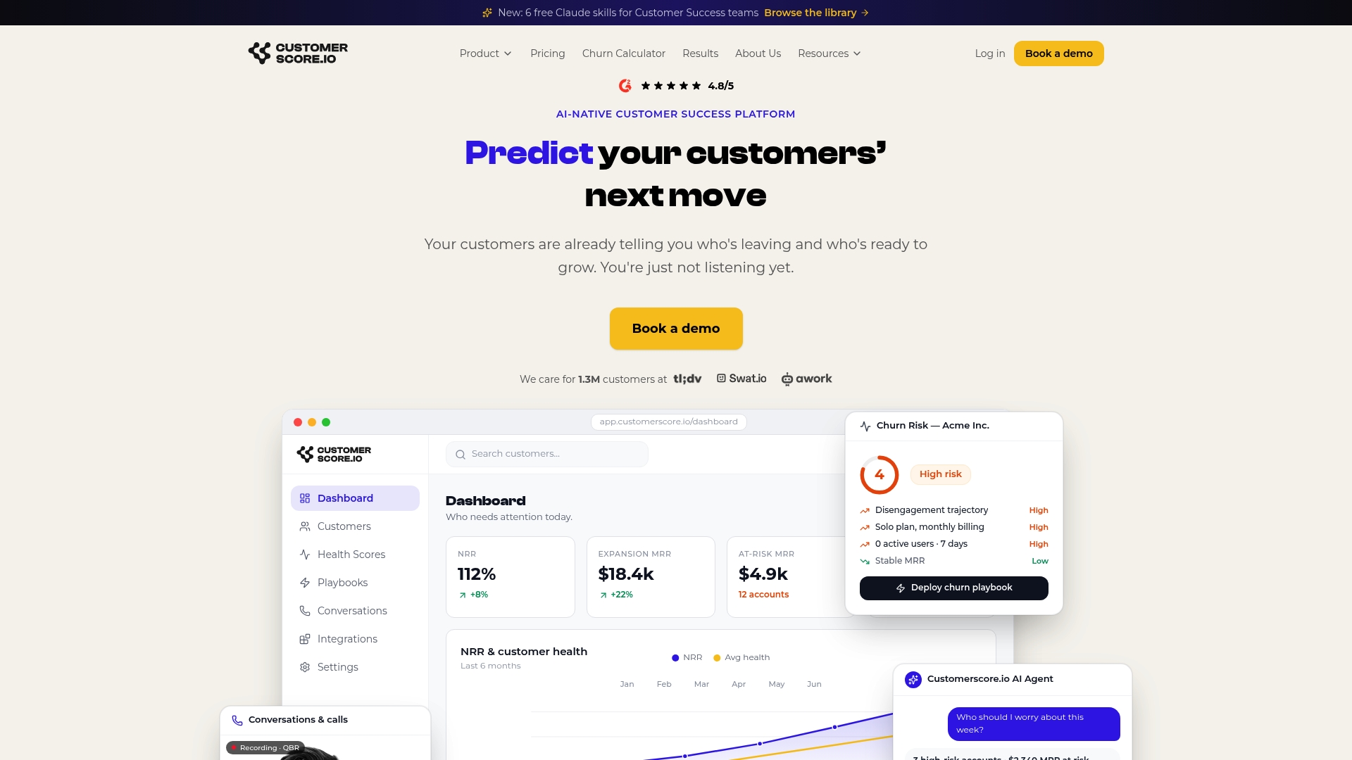
For B2B SaaS teams that are done building health scores in spreadsheets and chasing alerts manually, Customerscore provides AI-powered churn prediction and explainable health scoring in a platform designed specifically for CS, RevOps, and growth leaders. See how it maps to your current metric stack by booking a demo.
Useful sources and further reading
The sources below informed the formulas, cadence guidance, and survey recommendations in this guide. They are worth bookmarking for your own CS program documentation.
-
The 15 customer success metrics that actually matter (HubSpot) — Covers all core KPIs with dashboard examples and calculation methods. Strong reference for health score composition and scorecard design.
-
8 Key SaaS Customer Success Metrics (Help Scout) — Practitioner-focused breakdown of CLV, CRC, churn, NPS, CSAT, and CES with formulas. Useful for teams building their first metric framework.
-
How to Measure Customer Satisfaction (SurveyGauge) — Covers survey cadence, relationship vs. transactional measurement, and response-rate best practices. The source for the quarterly NPS cadence recommendation in this guide.
-
Customer Satisfaction: Definition, Metrics, Models (Kayako) — Explains CES as a churn predictor and covers survey fatigue remediation. Directly supports the CES and common-mistakes sections above.
-
Customer Success KPIs: 12 Metrics That Actually Matter (Featurebase) — Supports the balanced-scorecard recommendation and leading-indicator prioritization framework.
-
Customer success metrics (Fairview) — Focuses on health score explainability and audit practices. The source for the component-weighting guidance in the health score section.
-
How to measure customer satisfaction: 4 key metrics (Qualtrics) — Covers attitudinal, behavioral, and loyalty measurement dimensions. Useful background for NPS and CSAT design.
-
Stop Trying to Delight Your Customers (Harvard Business Review) — The original research behind CES and the finding that reducing effort outperforms delight investment for retention. Required reading for anyone building a CES program.
-
8 retention metrics PLG SaaS should look at (Customerscore) — Internal guidance on retention metrics for product-led companies, with practical examples beyond standard churn rate.
-
SaaS customer success glossary: 100 terms explained simply (Customerscore) — Standardized definitions for the metric terms used throughout this guide. Share with your CS, product, and RevOps teams to align on terminology before building dashboards.
-
Mobile app analytics: practical strategies for user engagement (Pocket App) — Applied examples for tracking DAU/MAU and feature adoption signals; relevant for product analytics teams feeding health score models.
Recommended
Related articles
90–120 Day Renewal System for CSMs: SaaS Renewal Playbook
90–120 Day Renewal System for CSMs: SaaS Renewal Playbook ! Team planning a structured SaaS renewal Run renewals as a 90 to 120 day managed pipeline, not a calendar reminder.
BlogCut Response Time 60% with This Slack for Customer Success Playbook
Cut Response Time 60% with This Slack for Customer Success Playbook ! Customer success team routing a Slack conversation Slack works best for customer success when it functions as the conversation
BlogProduct Led Customer Success in 90 to 180 Days Without a Data Team
Product Led Customer Success in 90 to 180 Days Without a Data Team ! Customer success operator reviewing product signals Product-led customer success uses product usage data and in-product
BlogPredict Churn 60–90 Days: Five Phase Customer Risk Scoring for B2B SaaS
Predict Churn 60–90 Days: Five Phase Customer Risk Scoring for B2B SaaS ! Customer success manager reviewing account risk dashboard Customer risk scoring produces a predictive, explainable health