
SaaS Cohort Analysis: The Operator's Guide to Retention


Cohort analysis groups customers by a shared starting event and tracks their retention and revenue over time, giving you a direct read on whether product, onboarding, or pricing changes are actually working. The single best first action: build a cohort matrix starting from an activation event (not raw signup) and plot both logo retention and dollar retention (MRR/NRR) side by side.
- Why activation, not signup? Most teams measure retention from signups instead of from the moment a user first gets value. That dilutes every curve with accounts that were never real. Activation-based cohorts produce clean, actionable signals.
- Why both logo and dollar retention? A cohort can show 60% logo retention but 110% dollar retention when surviving customers expand. Tracking only one metric hides whether you have a retention problem, an expansion engine, or both.
- What to measure first: Build three matrices: user/logo retention, revenue/NRR, and CAC payback by cohort. That trio connects retention signals directly to unit economics.
- Aggregate metrics lie. Aggregate MRR growth can mask degrading cohort retention; a cohort matrix shows whether recent cohorts retain better or worse than older ones.
Pro Tip: Read cohort charts column by column, not row by row. A single column shows you the same tenure point across every cohort, which is the clearest signal of whether your product is improving over time.
Table of Contents
- What cohort analysis is and the main cohort types used in SaaS
- Core cohort metrics, formulas, and why logo vs. dollar divergence matters
- How to run a SaaS cohort analysis from data to experiment
- How to choose cohort period and alignment
- Data sources, transformations, and ETL rules for reliable cohort inputs
- Best visualizations for cohort analysis and how to read them
- How to interpret cohort shapes and turn findings into experiments
- How to use cohort trends for revenue forecasting and LTV projections
- Common pitfalls in SaaS cohort analysis and a best-practices checklist
- Practical templates and SQL snippets to build your first cohort matrix
- Benchmarks and U.S. SaaS targets for retention and NRR
- Key Takeaways
- The part most teams get wrong about cohort analysis
- Customerscore turns cohort signals into automated retention workflows
- Useful sources and further reading
What cohort analysis is and the main cohort types used in SaaS
Cohort analysis is the practice of grouping customers who share a common starting event and then tracking a specific metric for each group across equal time intervals. The key word is groups: instead of a single aggregate number like "monthly churn rate," you get a grid that shows how each vintage of customers behaves independently.

That distinction matters because aggregate metrics routinely hide what cohort matrices reveal. A company growing MRR 15% month over month can simultaneously be watching its newest cohorts churn at twice the rate of cohorts from two years ago. The headline looks fine; the foundation is cracking.
Three cohort types every SaaS team should know:
Acquisition cohorts group customers by when they first signed up or made their first payment, typically bucketed by month. These are the baseline. They answer: "Are customers who joined in March 2025 retaining better than customers who joined in March 2024?" Use acquisition cohorts for retention trend detection and for comparing the quality of different growth periods.
Behavioral cohorts group customers by an action they took, usually in the first week or first month. For example: users who completed onboarding checklist in week 1, or accounts that ran their first report within 7 days of activation. Behavior-based cohorts isolate onboarding and feature-adoption effects in a way acquisition cohorts cannot. They are the right tool for diagnosing why early churn happens and for finding the product "aha moment" that predicts long-term retention.
Predictive cohorts are model-generated groups based on estimated churn risk or expansion likelihood. Instead of looking backward at what happened, predictive cohorts let CS teams act before a customer churns. They require more data infrastructure but connect directly to churn prediction workflows and automated playbooks.
Which tools feed each cohort type:
| Cohort type | Primary data sources | Common tools |
|---|---|---|
| Acquisition | Billing records, CRM | Stripe, Chargebee, Segment |
| Behavioral | Product event streams | Mixpanel, Amplitude, PostHog |
| Predictive | Combined billing + events | ML models, Customerscore |
| All types (analysis) | Exported data | Excel, Google Sheets, SQL (BigQuery, Postgres) |
For teams under $1M ARR, Excel or Google Sheets with a manual export from Stripe or Chargebee is enough to start. Once you need behavioral event data, Mixpanel, Amplitude, or PostHog handle cohort definitions natively. For custom ETL and full flexibility, SQL on BigQuery or Postgres is the standard approach.
Core cohort metrics, formulas, and why logo vs. dollar divergence matters
Getting the formulas right before you build the matrix saves hours of rework. Here are the metrics that belong in every SaaS cohort analysis.
Logo retention rate (also called customer retention rate):
Logo Retention at Month N = (Customers still active at Month N) / (Customers in original cohort) × 100
Monthly churn rate (cohort-level):
Cohort Churn Rate at Month N = (Customers lost by Month N) / (Customers in original cohort) × 100
MRR per cohort is simply the sum of monthly recurring revenue from all active accounts in a cohort at a given period. Track it alongside logo retention to catch divergence early.
Gross Revenue Retention (GRR): measures how much of the original cohort MRR you kept, ignoring expansion. GRR can never exceed 100%.
GRR = (Starting MRR – Churned MRR – Downgrade MRR) / Starting MRR × 100
Net Revenue Retention (NRR): adds expansion (upgrades, seat additions, usage overages) back in. NRR above 100% means the cohort is growing even with churn.
NRR = (Starting MRR – Churned MRR – Downgrade MRR + Expansion MRR) / Starting MRR × 100
For a deeper breakdown of how NRR drives SaaS valuation, the math compounds fast: a 10-point NRR improvement at $5M ARR is worth more than most new-logo acquisition campaigns.
ARPU per cohort = Total cohort MRR / Active accounts in cohort. Watch this trend upward over time as a sign of healthy expansion.

Cohort-based CLTV = Average cohort ARPU × Average cohort lifespan (in months). Use survival rates from your actual cohort data rather than a theoretical churn rate.
CAC payback by cohort: sum the cohort's gross profit month by month and compare it to that cohort's total acquisition cost. This is the defensible way to prove whether a specific growth period was profitable, not just whether the company overall is.
The logo vs. dollar divergence example:
Imagine a January cohort of 100 accounts at $500 MRR each ($50,000 total). By month 12:
| Metric | Value |
|---|---|
| Active accounts | 60 (60% logo retention) |
| Churned accounts | 40 |
| Remaining MRR | $50,000 |
| NRR | 110% |
Sixty percent of customers stayed, but the cohort generates more revenue than it started with. The 60 survivors expanded from $500 to roughly $917 average MRR. If you only tracked logo retention, you would flag this cohort as a problem. If you only tracked NRR, you would miss that 40% of customers found no lasting value. Both numbers are required to understand what is actually happening.
Benchmark anchor: B2B SaaS 30-day retention should land in a typical range indicative of onboarding health, with cohorts stabilizing by around month 6. Falling below these qualitative thresholds signals a leaky growth engine, not just normal churn.
For practical thresholds across the full SaaS retention metrics stack, track at minimum: logo retention, NRR, GRR, and ARPU trend per cohort.
On sample sizes: a cohort of fewer than 30 accounts produces noisy curves. Treat any cohort under 50 as directional only. For experiment comparisons, aim for at least 100 accounts per cohort before drawing conclusions about statistical differences.
How to run a SaaS cohort analysis from data to experiment
This is the full workflow, from blank spreadsheet to prioritized experiment list.
Step 1: Define your question
Write it down before touching data. "Are customers acquired through paid search retaining better than organic?" is a different analysis from "Is our new onboarding flow improving month-1 retention?" The question determines the cohort definition, the period, and the metric.
Step 2: Pick a cohort definition and period
Choose the starting event (activation, first payment, first core action) and the time bucket (daily, weekly, or monthly). For most B2B SaaS products, monthly cohorts aligned to billing periods are the right default.
Step 3: Identify and freeze the activation event
Pick one event that reliably signals a customer got value. Examples: "created first project," "invited a teammate," "ran first report." Measuring from activation prevents dilution by dead signups and produces curves you can actually act on. Once chosen, freeze this definition for at least 12 months.
Step 4: Extract and normalize data
Required data fields:
customer_id/account_idcohort_key(the month/week of activation)activation_event_timestampfirst_paid_datemrr_amount(normalized to monthly equivalent)invoice_id,plan_id,billing_periodacquisition_source- Key product event flags (activation, feature X used, etc.)
Pull billing data from Stripe or Chargebee. Pull product events from Mixpanel, Amplitude, PostHog, or Segment. Join on account_id.
Step 5: Construct the cohort matrix
Build two matrices: one for logo retention (% of original accounts still active) and one for MRR retention (% of original MRR still active, plus expansion). Rows are cohorts (e.g., "Jan 2025"). Columns are tenure periods (Month 0, Month 1, Month 2...).
For spreadsheets (Excel or Google Sheets), the Andrew Chen cohort layout is the standard starting point: cohort in rows, tenure in columns, with conditional formatting to create a heatmap. For SQL, see the template section below.
Step 6: Visualize
Apply a color gradient to the matrix (green = high retention, red = low). This heatmap immediately surfaces problem cohorts and tenure points where churn spikes.
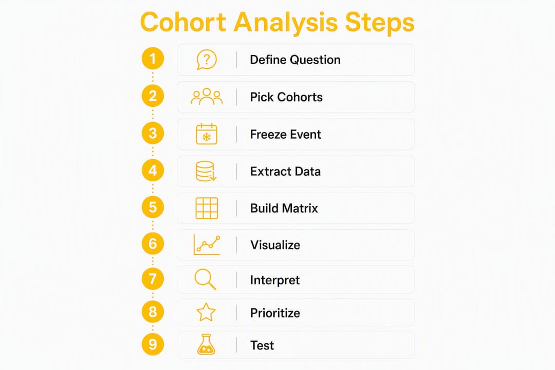
Step 7: Interpret
Read columns vertically. A column showing Month 3 retention across all cohorts tells you whether your product has improved at the 3-month mark over time. A single row tells you how one cohort aged, but it cannot tell you whether you are getting better.
Step 8: Prioritize experiments
Map the pattern you see to a root cause (see the interpretation section below). Rank experiments by impact × confidence × effort.
Step 9: Run tests and re-evaluate
After each experiment, create a new cohort that started after the change went live. Compare it to the pre-change cohort at the same tenure points. That comparison is your experiment result.
QA checklist before trusting the matrix:
- Reconcile total cohort MRR at Month 0 to your billing system export
- Confirm refunds, failed payments, and paused accounts are handled consistently
- Verify upgrades and downgrades are reflected in MRR, not just logo counts
- Check that pro-rated amounts in the first month are normalized to full monthly equivalents
- Confirm timezone consistency across event and billing timestamps
Tool selection by scale:
| ARR stage | Recommended tool |
|---|---|
| < $1M | Excel / Google Sheets + Stripe export |
| $1M–$5M | SQL (BigQuery or Postgres) + BI layer |
| $5M+ | Amplitude, Mixpanel, or PostHog for behavioral; SQL for billing cohorts |
| Any stage | Customerscore for automated multi-source cohort matrices |
Pro Tip: Before sharing a cohort matrix with stakeholders, add a row showing the sample size (n=) for each cohort. Cohorts with fewer than 50 accounts should be visually flagged — small samples create false confidence in both directions.
How to choose cohort period and alignment
The cohort period you choose shapes every conclusion you draw. Pick wrong and you either get noise (too granular) or miss the signal (too coarse).
Daily cohorts work for consumer apps or free-trial products where the first 72 hours determine whether someone activates. For most B2B SaaS, daily cohorts are too noisy and too small per bucket to be meaningful.
Weekly cohorts suit mid-speed SaaS products with short sales cycles and active trial periods. They give faster feedback than monthly cohorts while keeping sample sizes manageable.
Monthly cohorts are the standard for B2B SaaS with monthly or annual billing. They align naturally to billing periods, which makes MRR cohort math straightforward. Most investor-facing retention analyses use monthly cohorts.
Left-aligned vs. right-aligned cohorts:
Left-aligned cohorts start every cohort at Month 0 and extend rightward. This is the standard heatmap format. It is ideal for comparing decay curves across cohorts: you can see whether a February cohort drops faster in Month 2 than a September cohort did.
Right-aligned cohorts anchor all cohorts at the current date and extend leftward. This shows you the current state of each cohort at its actual age. Useful for comparing how cohorts of different ages are performing right now, rather than how they decayed from their starting point.
| Cohort period | Sample size needed | Best visualization | Primary use case |
|---|---|---|---|
| Daily | 200+ per day | Retention curve | Trial/activation optimization |
| Weekly | 50+ per week | Heatmap or curve | Onboarding experiments |
| Monthly | 30+ per month | Heatmap (standard) | Billing-aligned MRR/NRR |
| Quarterly | 20+ per quarter | Cohort index | Enterprise / long sales cycle |
Practical rule: match your cohort granularity to your product's natural engagement cadence. A project management tool used daily should use weekly cohorts. An annual-contract enterprise product should use quarterly cohorts for meaningful signals.
For annual contracts specifically, convert to monthly equivalent MRR (ACV / 12) and treat the cohort start as the contract start date, not the renewal date. Alternatively, run a separate cohort analysis for annual vs. monthly subscribers, since their churn dynamics differ significantly.
Data sources, transformations, and ETL rules for reliable cohort inputs
The most common reason cohort analysis fails is not the analysis itself. It is dirty input data.
Canonical schema for a SaaS cohort pipeline:
account_id(primary key, never change)contact_id(for multi-seat products)activation_event_timestamp(frozen definition)first_paid_datemrr_amount(monthly equivalent, in USD)invoice_idplan_idbilling_period(monthly or annual)acquisition_sourceevent_flags(activation, feature_X_used, etc.)
ETL rules and edge cases:
- Deduplication: accounts can appear multiple times in billing exports (multiple invoices, plan changes). Deduplicate on
account_idbefore computing cohort keys. - MRR normalization: annual contracts must be divided by 12. A $12,000 annual contract = $1,000 MRR. Never count the full annual amount in Month 0.
- Upgrades and downgrades: record the MRR delta in the month it takes effect. An upgrade from $500 to $800 in Month 4 adds $300 to cohort MRR at Month 4 without changing the logo count.
- Refunds: remove refunded MRR from the month it was originally recorded. Do not let refunds appear as churn in a later month.
- Proration: normalize pro-rated first invoices to the full monthly equivalent before assigning to a cohort.
- Multi-currency: convert all amounts to USD at the exchange rate on the invoice date. Store the original currency and amount separately for audit purposes.
Pro Tip: For annual contracts, run two parallel cohort analyses: one treating annual subscribers as a separate cohort type, and one using monthly equivalent MRR for a unified view. They answer different questions. The unified view is better for NRR reporting; the separated view is better for understanding renewal risk.
Handling re-activated accounts: when a churned account reactivates, do not move it to a new cohort. Keep it in its original cohort and mark it as reactivated. Count it as active from the reactivation date forward. This preserves cohort integrity and lets you measure reactivation rates separately.
QA reconciliation steps:
- Export total MRR from Stripe or Chargebee for a given month
- Sum cohort MRR across all active cohorts for the same month
- The two numbers should match within rounding tolerance (< 0.5%)
- If they do not, the most common culprits are: annual contract normalization errors, unhandled refunds, or duplicate account records
Activation event rules: choose one event, document it, and freeze it. "First login" is almost always wrong because it includes accounts that never got value. "Created first [core object]" or "completed onboarding step 3" are better candidates. Behavioral cohort tools like Amplitude, Mixpanel, and PostHog let you define these events directly in the UI without writing SQL.
Best visualizations for cohort analysis and how to read them
Three visualization types cover most of what SaaS teams need. Each surfaces a different signal.
The cohort heatmap is the standard format: cohorts in rows, tenure periods in columns, retention percentage in each cell, colored from green (high) to red (low). At a glance, you can see:
- Horizontal bands of red: a specific cohort that churned faster than others (acquisition quality problem, or a bad product period)
- Vertical bands of red: a specific tenure point where churn spikes across all cohorts (onboarding failure, pricing cliff, or a feature gap at that lifecycle stage)
- Diagonal improvement: newer cohorts showing higher retention at the same tenure points than older cohorts (product is getting better)
The retention curve plots a single cohort's retention percentage over time on a line chart. The shape tells the story:
- Cliff drop: steep fall in Month 1–2, then flattening. Classic onboarding problem.
- Steady decay: gradual decline that never stabilizes. Product-market fit issue or weak habit formation.
- Frown shape: drops, then partially recovers. Often seasonal or tied to a specific use case.
- Flat tail: drops early, then stabilizes at 12–24 months. This flat tail is the gold standard investors look for — it signals durable customer fit.
The cohort index normalizes all cohorts to a baseline (usually the oldest cohort = 100) and plots relative performance. This removes absolute-level differences and shows whether you are improving, declining, or flat over time. Useful for board presentations and for comparing cohorts across very different ARR periods.
Reading cohort charts column by column is the highest-leverage skill. A single column shows whether newer cohorts retain better or worse than older ones at the same tenure, which is the clearest signal of product improvement. Most people read rows (how did the January cohort age?) when they should start with columns (is Month 3 retention improving across all cohorts?).
Annotations to add to every chart:
- Activation milestones (when you changed the onboarding flow)
- Product releases that affected core features
- Pricing or packaging changes
- Campaign starts that changed acquisition mix
Without annotations, a drop in Month 2 retention looks like a product problem. With annotations, you might see it coincides with a pricing change that attracted lower-intent buyers.
Pro Tip: Always show sample size (n=) per cohort row on any heatmap you share. A cohort of 12 accounts with 80% retention at Month 6 is noise. A cohort of 200 accounts with the same number is a signal worth acting on.
How to interpret cohort shapes and turn findings into experiments
The pattern you see in a cohort matrix is a diagnosis. The experiment is the treatment. Here is how to connect them.
Common cohort shapes and what they mean:
-
Cliff in Month 1–2: Most churn happens immediately after signup or first payment. Root cause: onboarding failure, misaligned expectations, or time-to-value is too long. Experiments: shorten onboarding checklist, add a human touchpoint at Day 3, introduce a "quick win" feature earlier in the flow.
-
Steady decay with no tail: Retention keeps declining through Month 12 with no stabilization. Root cause: weak habit formation, product does not solve a recurring problem, or customers are using it for a one-time task. Experiments: identify the behavioral cohort that does retain and reverse-engineer what they did differently; add use-case-specific onboarding tracks.
-
Frown shape (drops then partially recovers): Retention falls, then some customers return. Often seasonal (annual budgeting cycles) or tied to a specific trigger event. Experiments: identify the re-engagement trigger and build it into the product proactively.
-
Flat tail at Month 6+: The cohort stabilizes. This is the target shape. Experiments here focus on moving the stabilization point earlier (from Month 6 to Month 3) and raising the floor.
-
Vertical red column at a specific tenure: Churn spikes at the same month across all cohorts. Classic causes: annual renewal cliff, a feature gate at a certain plan tier, or a lifecycle moment where customers re-evaluate. Experiments: proactive renewal outreach, in-app value reminders at that tenure point, or pricing restructure.
Prioritization framework:
Rank experiments by: Impact (how many accounts or how much MRR is affected) × Confidence (how clearly the cohort data points to this cause) × Effort (engineering and CS time required). Cohort data directly informs confidence: if Month 2 retention has been declining for six consecutive cohorts, confidence in an onboarding experiment is high.
For churn pattern diagnosis that goes deeper than cohort shapes, segment by acquisition source, plan type, and company size to isolate which sub-populations drive the pattern.
Success metrics for each experiment type:
- Onboarding experiment: cohort Week-4 retention lift (target: +5–10 percentage points)
- Pricing change: cohort Month-3 NRR delta
- Feature adoption nudge: behavioral cohort activation rate for the target feature
- Renewal outreach: cohort Month-12 logo retention vs. control
On statistical significance: with cohort experiments, you rarely have the luxury of large sample sizes. A practical rule: wait until both the test and control cohorts have at least 50 accounts and at least 8 weeks of post-change data before drawing conclusions. For self-service SaaS products with higher volume, you can move faster; for enterprise products, directional signals from smaller cohorts are often the best you will get.
Segment cohorts by industry, company size, and customer persona to find which sub-populations respond to which experiments. A pricing change that improves retention for SMB accounts may hurt enterprise accounts. Segmented cohorts surface that difference; aggregate cohorts hide it.
How to use cohort trends for revenue forecasting and LTV projections
Cohort survival rates are the most honest input for a revenue forecast. Here is the practical method.
Simple cohort-based projection:
- Take the observed survival rate at each tenure point (e.g., 80% at Month 1, 68% at Month 2, 58% at Month 3...)
- Apply those rates forward to new cohorts entering the model
- Add observed expansion rates (average MRR growth per surviving account per month)
- Sum across all active cohorts to project forward MRR
This produces a bottom-up forecast that is grounded in actual customer behavior rather than a top-down growth assumption.
Why improving Month-3 retention changes everything:
If your current Month-3 logo retention is 55% and you move it to 65%, you retain 10 more accounts per 100 acquired. At $500 average MRR, that is $5,000 in additional MRR per cohort that compounds forward. Across 12 cohorts in a year, the ARR impact is material. CAC payback also improves because the same acquisition cost now funds a longer revenue stream.
Use a SaaS churn calculator to model the revenue impact of specific retention improvements before committing to an experiment. It makes the business case for engineering time concrete.
Cohort-based LTV:
Cohort LTV = Average cohort ARPU × (1 / Monthly churn rate for that cohort)
For a more precise estimate, use the actual survival curve from your cohort data rather than a steady-state churn assumption. The survival curve accounts for the fact that early churn is higher than late churn, which a simple 1/churn formula misses.
Caveats and model risks:
- Changing acquisition mix (new channels, new segments) means new cohorts may not follow historical survival rates
- Price changes break the ARPU trend line; model pre- and post-price-change cohorts separately
- Cohort definition drift (changing the activation event mid-stream) invalidates comparisons
- Seasonality can make recent cohorts look better or worse than they are; use at least 12 months of cohort history before trusting trend lines
For investor narratives: present NRR by cohort vintage alongside the aggregate NRR number. Showing that your most recent three cohorts have NRR above 110% while older cohorts are at 95% tells a story of product improvement that a single NRR figure cannot. The retention economics math behind this compounds significantly at scale.
Common pitfalls in SaaS cohort analysis and a best-practices checklist
Most cohort analyses that produce bad decisions share the same handful of mistakes.
Top pitfalls:
- Measuring from signup instead of activation. This is the most common error. Dead signups dilute every retention curve and make onboarding look worse than it is.
- Changing cohort definitions mid-stream. If you redefine "activation" in Month 6, you cannot compare new cohorts to old ones. Freeze definitions for at least 12 months.
- Ignoring upgrades and downgrades in MRR cohorts. Tracking only logo retention while ignoring MRR changes produces a false picture of cohort health.
- Mixing billing and behavioral cohorts without clear mapping. A behavioral cohort (users who completed onboarding) and an acquisition cohort (users who signed up in January) answer different questions. Conflating them produces uninterpretable results.
- Over-interpreting small cohorts. A cohort of 15 accounts with 80% Month-6 retention is not a success story. It is noise.
- No annotations on charts. A retention drop that coincides with a pricing change looks like a product problem without the annotation.
Best-practices checklist:
- Freeze cohort definitions (activation event, cohort period, MRR normalization rules) for 12 months minimum
- Reconcile cohort-level MRR to billing system exports monthly
- Annotate all charts with product releases, pricing changes, and campaign starts
- Track both logo retention and dollar retention in every analysis
- Include sample size (n=) on every cohort row in shared charts
- Segment by acquisition source and company size before drawing conclusions about the "average" cohort
- Run QA on the ETL pipeline every time a billing system change or product event schema change occurs
Data governance notes:
- Retain raw event history indefinitely; you cannot rebuild historical cohorts from aggregated data
- Standardize timezones across billing and product event systems (UTC is the safe default)
- Store original currency amounts alongside USD equivalents; exchange rates change and you may need to restate historical MRR
- Document every cohort definition change with a date stamp so future analysts can understand why pre- and post-change cohorts are not directly comparable
Practical templates and SQL snippets to build your first cohort matrix
Getting the infrastructure right the first time saves weeks of rework.
Spreadsheet layout (Excel / Google Sheets)
The Andrew Chen cohort layout is the standard:
- Column A: Cohort label (e.g., "Jan 2025", "Feb 2025")
- Column B: Cohort size (n=)
- Columns C onward: Month 0, Month 1, Month 2... (retention % or MRR)
- Conditional formatting: apply a green-to-red color scale to all data cells
For activation-based cohorts, replace the cohort label with the activation month rather than the signup month. Add a second sheet for MRR retention using the same layout, with dollar amounts instead of percentages.
SQL pseudocode (Postgres / BigQuery style)
Step 1: Build the cohort key
SELECT
  account_id,
  DATE_TRUNC('month', activation_event_timestamp) AS cohort_month,
  DATE_TRUNC('month', event_date) AS activity_month,
  mrr_amount
FROM events
WHERE activation_event_timestamp IS NOT NULL
Step 2: Normalize MRR to monthly equivalent
SELECT
  account_id,
  CASE
    WHEN billing_period = 'annual' THEN mrr_amount / 12
    ELSE mrr_amount
  END AS normalized_mrr
FROM billing_records
Step 3: Assemble the cohort matrix
SELECT
  cohort_month,
  DATEDIFF('month', cohort_month, activity_month) AS tenure_month,
  COUNT(DISTINCT account_id) AS active_accounts,
  SUM(normalized_mrr) AS cohort_mrr
FROM cohort_base
GROUP BY cohort_month, tenure_month
ORDER BY cohort_month, tenure_month
Divide active_accounts by the Month 0 count for each cohort to get logo retention %. Divide cohort_mrr by the Month 0 MRR for each cohort to get dollar retention %.
BI and product analytics tools
Amplitude: use the Retention Analysis chart. Define the starting event (activation) and the returning event (any session or specific feature use). Switch to "N-Day Retention" for daily products or "Unbounded Retention" for weekly/monthly products. Export the underlying data for MRR overlays.
Mixpanel: use the Retention report. Define entry event and retention event. For MRR cohorts, you will need to join Mixpanel user data with Stripe or Chargebee exports in a BI tool.
PostHog: the Retention insight supports both event-based and action-based cohort definitions. PostHog's open-source nature makes it popular for teams that want full data control.
Stripe / Chargebee exports: both platforms export subscription data with customer IDs, plan details, MRR amounts, and event dates. Use these as the billing source and join to product event data on customer_id or account_id.
Callout: a ready-to-use cohort matrix template (spreadsheet + SQL) is available in the Customerscore demo. See the promo section below for access details.
Benchmarks and U.S. SaaS targets for retention and NRR
Knowing your numbers is only useful if you know what good looks like.
NRR benchmarks by segment:
| Segment | NRR target | Warning threshold |
|---|---|---|
| SMB-focused SaaS | 100%+ | Below 90% |
| Mid-market SaaS | 110%+ | Below 95% |
| Enterprise SaaS | 110%+ | Below 100% |
| Public SaaS leaders | 115–135% | Below 110% |
These NRR targets reflect the current benchmarks for U.S. SaaS companies. An NRR below 90% means the business is shrinking its existing revenue base regardless of new logo growth, which is a structural problem that new-logo acquisition cannot fix.
Retention rate benchmarks:
| Tenure point | B2B SaaS target | Interpretation |
|---|---|---|
| 30-day retention | 40–60% | Below 40% = onboarding failure |
| Month-6 retention | around 30% or more (stabilizing) | Below 25% = product-market fit risk |
| Month-12 retention | Flat tail forming | Flat tail = durable customer fit |
| Month-24 retention | Stable or expanding | Expansion offsetting logo churn |
B2B SaaS 30-day retention in a mid-range band is considered healthy; falling below this range at 30 days almost always points to an onboarding or time-to-value problem rather than a product quality issue.
The presence of a flat retention tail after one year is the metric that matters most for long-term valuation. A stable retention tail signals durable customer fit and is a primary signal investors use when assessing SaaS quality. A company with mid-level logo retention that stabilizes earlier is often more valuable than one with higher early retention but declining long term.
Key signal: if your cohort retention curves never flatten, the business has a product-market fit problem, not a churn problem. No amount of CS intervention fixes a product that customers stop needing.
For additional context on U.S. SaaS retention distributions, the 44,000-user retention study on Customerscore's site provides practical distribution data across product types and company sizes.
Timeline to see cohort improvements: most onboarding experiments show measurable impact at Month 1–2. Pricing and packaging changes show up at Month 3–6. Product depth improvements that affect long-term retention take 6–12 months to appear in cohort data. Plan experiment timelines accordingly.
Key Takeaways
Cohort analysis in SaaS is only as useful as the activation event you choose and the discipline you bring to reading both logo and dollar retention together.
| Point | Details |
|---|---|
| Start from activation, not signup | Measuring from the first core action removes dead signups and produces clean, actionable retention curves. |
| Track logo and dollar retention together | A cohort can show 60% logo retention and 110% NRR simultaneously; both numbers are required to diagnose health. |
| Read columns, not just rows | Comparing the same tenure point across cohorts (column-by-column) is the clearest signal of whether your product is improving. |
| NRR targets by segment | SMB SaaS should target 100%+ NRR; mid-market and enterprise should target 110%+; public SaaS leaders should target 115–135%; below 90% is a structural warning. |
| Customerscore automates the matrix | Customerscore integrates billing (Stripe, Chargebee), product events (Mixpanel, PostHog), and CRM to generate automated logo and dollar cohort matrices with playbook triggers. |
The part most teams get wrong about cohort analysis
There is a version of cohort analysis that every SaaS team does, and a version that actually changes decisions. Most teams are doing the first one.
The common pattern: someone builds a cohort heatmap, shares it in a quarterly review, everyone nods at the colors, and nothing changes. The matrix becomes a reporting artifact rather than a diagnostic tool. The reason this happens is not a lack of data. It is a lack of a closed loop between the cohort signal and the experiment.
The teams that get real value from cohort analysis treat it as a diagnostic system with a defined output: a ranked list of experiments, each tied to a specific cohort pattern, with a pre-agreed success metric. The cohort matrix is not the deliverable. The experiment list is.
There is also a subtler trap: teams that track NRR and declare victory because it is above 100%. NRR above 100% can mask a logo retention problem that will eventually catch up with the business. If your top 20% of accounts are expanding fast enough to offset churn from the bottom 40%, your NRR looks healthy while your customer base is quietly hollowing out. The cohort matrix catches this; the aggregate NRR number does not.
The other thing worth saying plainly: cohort analysis is not a one-time project. The value compounds when you run it consistently, annotate it religiously, and use it to evaluate every significant product or pricing change. A team that has 24 months of annotated cohort history can answer questions that a team with a single snapshot cannot. That history is a competitive asset.
Customerscore turns cohort signals into automated retention workflows
Running cohort analysis manually works up to a point. Once you have multiple acquisition channels, annual and monthly billing, and a CS team managing hundreds of accounts, the manual approach breaks down fast.
Customerscore is built specifically for B2B SaaS teams that want to move from cohort insight to automated action. The platform pulls billing data from Stripe and Chargebee, product events from Mixpanel, PostHog, and Segment, and CRM data from HubSpot and Salesforce into a single cohort view. Logo retention and dollar retention are calculated automatically, split by segment, and updated in real time.

Where Customerscore goes beyond a BI dashboard: when a cohort pattern triggers a health score threshold, the platform fires a playbook automatically. An onboarding cohort showing early drop-off at Week 2 triggers a CS outreach sequence. A renewal cohort showing declining NRR triggers an expansion workflow. The AI churn prediction layer adds predictive cohorts on top of the historical ones, flagging accounts at risk before they appear in the next month's retention numbers.
For B2B SaaS teams in the U.S. that want to operationalize cohort-driven retention, the Customer Success Platform covers the full workflow: data integration, cohort matrices, health scoring, playbooks, and renewal management. All integrations use secure, U.S.-compliant data handling.
Book a demo to see a live cohort matrix built from your own billing and product data.
Useful sources and further reading
The benchmarks and methodology in this guide draw from the following sources. Each is worth reading directly for deeper implementation detail.
- Net Revenue Retention Benchmarks 2026 — Digital Applied: the primary source for NRR targets by segment used in the benchmarks section.
- SaaS Cohort Analysis Guidance — Stripe: Stripe's own guide on behavioral cohort definitions and activation-based measurement.
- How to Increase Customer Retention: 5 Proven Strategies — BabyLove Growth: practical retention strategies that map directly to cohort-diagnosed problems.
For the cohort matrix template and SQL starter kit, book a Customerscore demo using the link above.
Recommended
Related articles
90–120 Day Renewal System for CSMs: SaaS Renewal Playbook
90–120 Day Renewal System for CSMs: SaaS Renewal Playbook ! Team planning a structured SaaS renewal Run renewals as a 90 to 120 day managed pipeline, not a calendar reminder.
BlogCut Response Time 60% with This Slack for Customer Success Playbook
Cut Response Time 60% with This Slack for Customer Success Playbook ! Customer success team routing a Slack conversation Slack works best for customer success when it functions as the conversation
BlogProduct Led Customer Success in 90 to 180 Days Without a Data Team
Product Led Customer Success in 90 to 180 Days Without a Data Team ! Customer success operator reviewing product signals Product-led customer success uses product usage data and in-product
BlogPredict Churn 60–90 Days: Five Phase Customer Risk Scoring for B2B SaaS
Predict Churn 60–90 Days: Five Phase Customer Risk Scoring for B2B SaaS ! Customer success manager reviewing account risk dashboard Customer risk scoring produces a predictive, explainable health