
Measure Median TTV and Activation Rate to Predict SaaS Retention


Time to Value and activation rate are the two onboarding metrics that actually predict retention, and everything else you track should support one of them. Customers who hit first value inside 14 days retain at roughly 80% or higher at 12 months, while those who miss that window drop to 35 to 50%. Onboarding completion rate matters too, but only as a diagnostic. This article walks through the definitions, formulas, 2026 benchmarks, instrumentation, and the experiments that move both numbers.
TL;DR:
- Maintaining a median time to first meaningful value under five minutes is essential for self-serve SaaS products to enhance retention and growth.
- Activation rate and median time to value are the most impactful metrics to track because they directly predict customer retention and revenue.
- Cohort-based measurement and precise definitions of value events are crucial to accurately assess onboarding success across different customer segments.
- Tools like product analytics, onboarding platforms, and CRM systems should be matched to specific metrics for reliable, real-time insights.
- Automating health signals through platforms like Customerscore can proactively flag stalled onboardings and improve retention efforts.
Table of Contents
- What Onboarding Metrics Should SaaS Teams Prioritize?
- How Do You Calculate Onboarding Metrics Correctly?
- What Are Realistic Onboarding Benchmarks for 2026?
- Which Tools Should Track Each Onboarding Metric?
- How Do You Turn Onboarding Metrics Into Action?
- Who Owns Onboarding Metrics Once You're Tracking Them?
- How Customerscore Supports Onboarding Measurement
- A Practitioner's Take on Where to Start
- Ready to Act on Your Onboarding Data?
- Sources
What Onboarding Metrics Should SaaS Teams Prioritize?
Not every onboarding number deserves equal attention. A tiered structure keeps teams from drowning in dashboards and lets you act on the metrics that actually move revenue, an approach Pixxen's SaaS onboarding framework also organizes around a small set of high-leverage numbers.
Tier 1: outcome metrics. These predict retention directly.
- Time to Value (TTV): the time between signup and the moment a customer experiences the outcome they bought your product for. Formula:
TTV = date of value event − date of signup, measured per account or user. - Time to First Value (TTFV): a narrower cut of TTV, focused on the very first meaningful action (first report generated, first automation run, first integration connected).
- Activation rate: the share of signups who complete your defined activation event within a set window. Formula:
Activation Rate = (activated accounts ÷ total signups) × 100.
Tier 2: process and conversion metrics. These explain why Tier 1 numbers move.
- Onboarding completion rate: percentage of accounts finishing your defined onboarding checklist or flow.
- Early retention (day-30 and day-90): percentage of activated accounts still logging in or using core features at those marks.
- Trial-to-paid conversion: percentage of trial accounts that convert to a paid plan.
- Feature adoption depth: number or percentage of core features a customer has actually used, not just viewed.
Tier 3: diagnostic and operational metrics. These flag where something is breaking.
- Support ticket volume during onboarding: spikes here usually point to a confusing step, not a bad product.
- Drop-off rate by onboarding phase: shows exactly where accounts stall.
- Stalled accounts / watchlist count: accounts that haven't advanced in X days, tracked as a live list rather than a monthly report.
Treat Tier 3 as your early-warning system. Tier 1 tells you if onboarding is working; Tier 3 tells you why it isn't.
How Do You Calculate Onboarding Metrics Correctly?
The formulas above are simple. Getting them right depends on three things: how you define the activation event, whether you use median or mean, and how you cohort your data.
- Write a one-sentence definition of your "value event" before you measure anything. If you can't describe it in one sentence ("the customer connects their billing data and sees their first health score"), your activation number will be noise.
- Calculate activation rate on a fixed window. Pick 7, 14, or 30 days post-signup, and never change the window mid-quarter or you'll break trend comparisons.
- Use median time-to-event for TTV, not mean. A handful of stalled enterprise accounts that finally activate after 90 days will drag your average TTV up and hide the fact that most customers succeed in five days. Median time-to-event on the activated cohort only, as onboarding measurement practitioners recommend, gives you the number that reflects typical experience.
- Cohort by signup week, ARR segment, and onboarding motion (self-serve versus sales-assisted versus enterprise). Blending a $200/month self-serve account with a $50,000 enterprise contract into one TTV number tells you nothing useful.
- Deduplicate events at the source. Double-fired activation events from retries or webhook replays inflate completion and adoption numbers silently.
Pro Tip: If your activation rate looks great but day-30 retention is weak, don't trust the activation number. Check whether your activation event is too easy to trigger, like a page view instead of a real usage action.
Completion rate deserves one caveat: high completion paired with low activation is a warning sign, not a win. It usually means your checklist tracks steps customers finish out of obligation, not steps tied to real value.
What Are Realistic Onboarding Benchmarks for 2026?
Median activation rate across B2B SaaS sits around 36 to 38%, and top-quartile performers push past 55%, according to tiered onboarding benchmarking data.
Self-serve products should aim for TTFV under five minutes; the strongest self-serve SaaS products hit this mark, while guided or sales-assisted onboarding often stretches TTV to one to two weeks, and enterprise deployments to 30 to 60 days. Use these as orientation, not targets to hit artificially. Segment your own benchmark by product complexity, then track whether each cohort's median TTV shrinks quarter over quarter.
Which Tools Should Track Each Onboarding Metric?
Match the data source to the metric instead of forcing one tool to do everything. Product analytics platforms (Mixpanel, PostHog, Amplitude) own activation and TTV because they see raw event data. Onboarding or customer success platforms own completion rate and cycle time because they track checklist and phase progress. Your CRM or billing system (Salesforce, HubSpot, Stripe, Chargebee) owns contract start dates and ARR segmentation.
A practical dashboard needs four panels:
- An activation funnel showing drop-off between signup, key milestones, and the activation event.
- Median TTV broken out by cohort (signup week and ARR band).
- A live stalled-accounts watchlist, sorted by days since last progress.
- Cohort retention curves at day-30 and day-90, layered by onboarding motion.
For teams running multiple data sources, joining product events with CRM and billing data in a warehouse is what makes cross-source dashboards reliable instead of guesswork stitched together in spreadsheets. Real-time alerts on the stalled-accounts panel matter more than the dashboard's design. A dashboard nobody checks daily is decoration, not instrumentation.
How Do You Turn Onboarding Metrics Into Action?
Measurement without action is just a report nobody reads. Prioritize the metric with the biggest gap between your number and the benchmark, and the most room to move. That's usually activation rate or TTV, not a Tier 3 metric.
- Cut steps between signup and first value. If your activation event requires five setup screens, test cutting it to two and pre-filling data from integrations wherever possible.
- Build a proactive outreach policy for stalled accounts. Define "stalled" precisely (no progress in 5 days for self-serve, 10 for enterprise) and route it automatically to a customer success owner.
- Add in-product nudges to deepen feature adoption. Target the specific feature that correlates with day-90 retention in your data, not the feature your team is most proud of.
Structure every experiment the same way: state the hypothesis, name the target metric, define the cohort, set a measurement window, and calculate the minimum sample size before you launch. Statistically rigorous cohort testing on meaningful flow changes beats a dozen small UI tweaks that never reach significance.
Pro Tip: Test one full onboarding flow variant against your current flow rather than five micro-changes at once. You'll get a clean read on whether the redesign works instead of a pile of inconclusive A/B tests.
Who Owns Onboarding Metrics Once You're Tracking Them?
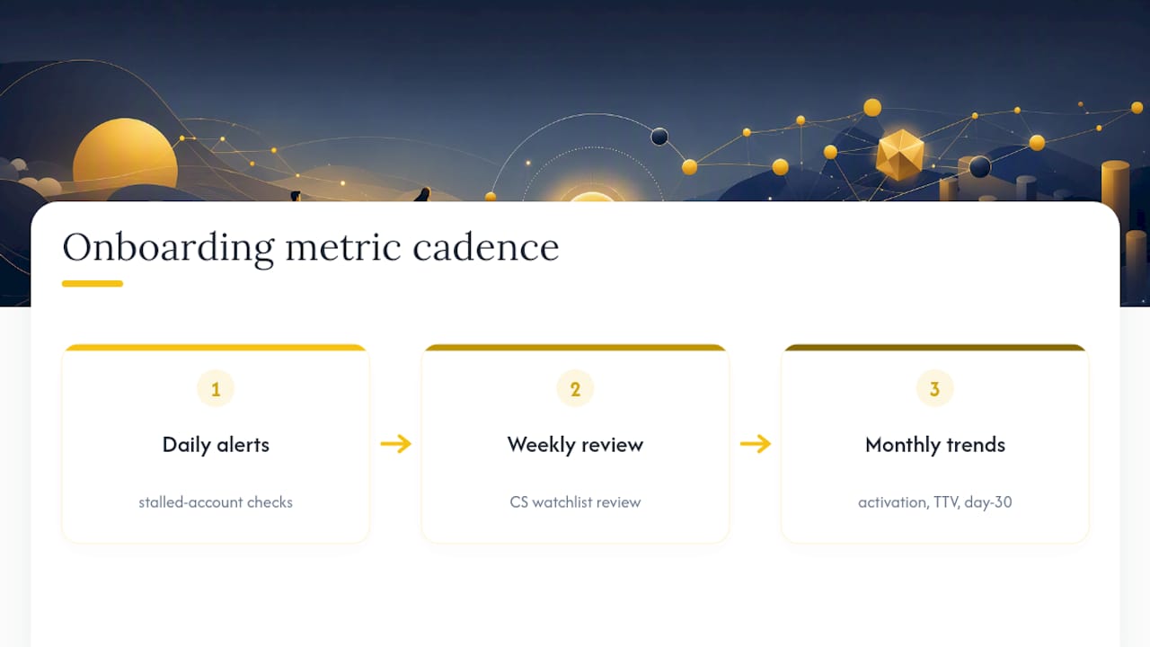
Metrics fail without a cadence and clear ownership. Run stalled-account alerts daily, review the watchlist weekly with customer success, and review trend lines (activation rate, median TTV, day-30 retention) monthly with product and leadership.
Ownership splits cleanly: customer success owns the rescue motion for stalled accounts, product owns changes to the onboarding flow itself, and analytics owns experiment design and cohort validation. A workable OKR pairing looks like "Reduce median TTV for self-serve signups from 9 days to 6 days this quarter" paired with "Increase day-30 retention for that same cohort by 8 points." Tie every OKR to a metric someone already owns, or it won't survive the next planning cycle.
How Customerscore Supports Onboarding Measurement
Customerscore combines usage data, billing data, and CRM signals into a single health score, which is exactly the join most teams struggle to build manually across product analytics, onboarding tools, and Salesforce or HubSpot. That scoring approach surfaces stalled onboardings earlier than manual account review typically catches them, turning the Tier 3 diagnostics above into automated alerts rather than a weekly spreadsheet chore.
For teams building out the watchlist and rescue workflow described earlier, Customerscore's onboarding spaces give customer success owners a shared view with the customer, while churn prediction models flag accounts trending toward a stalled state before they hit day 30. Related reading on the 44,000-user retention study and reducing self-service churn covers implementation detail this article doesn't have room for.

A Practitioner's Take on Where to Start
If you only fix one thing this quarter, fix the median TTV to first meaningful outcome. Not the mean, not a vanity activation click. The metric that shows how long a typical customer actually waits before your product proves its worth.
Start by defining that value event in one sentence, then run a single experiment against it: cut one onboarding step, measure the cohort for 30 days, and compare median TTV against your baseline. Everything else, adoption depth, NPS, ticket volume, matters more once that number is moving in the right direction.
Patrik
Ready to Act on Your Onboarding Data?
Watching activation rate and TTV in a spreadsheet only gets you so far. Customerscore turns those same signals, usage events, billing data, CRM stages, into an automated health score that flags stalled onboardings before they become churn statistics, so your customer success team spends time on rescues instead of manual account reviews.
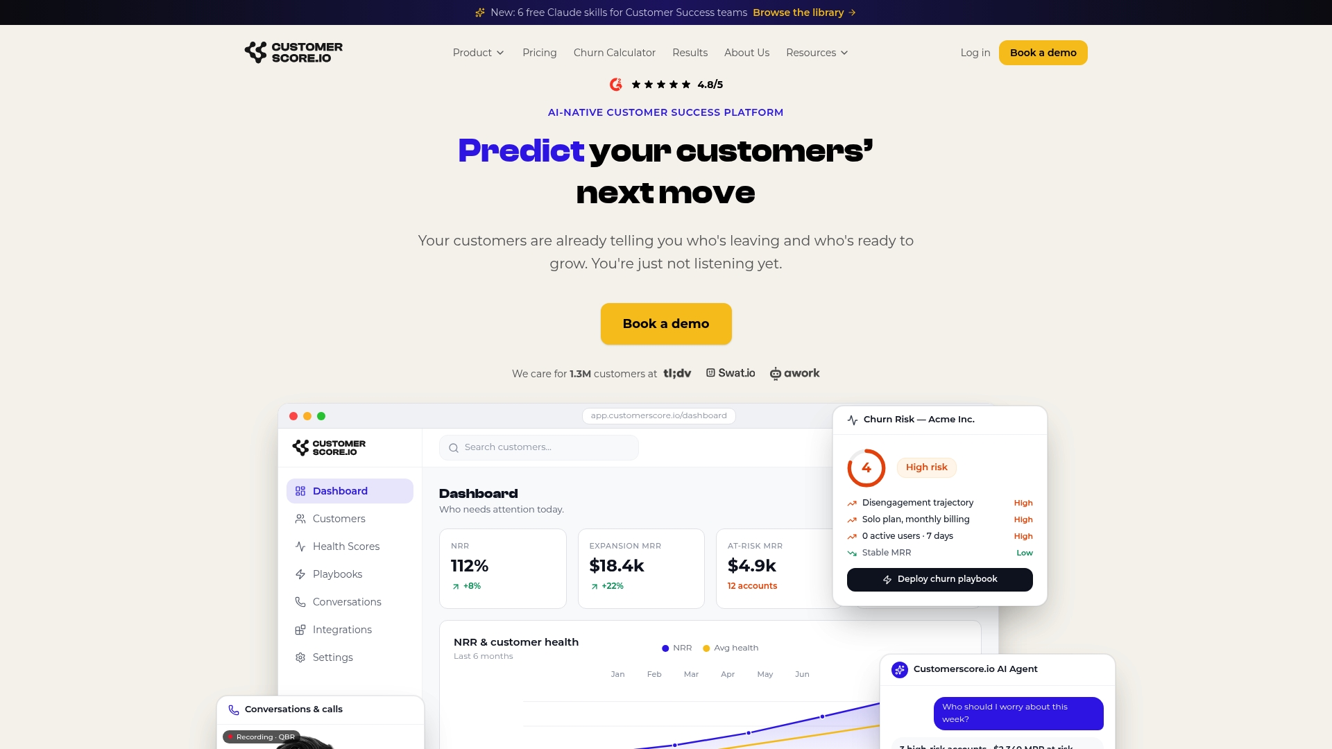
The platform's churn prediction software applies this scoring across your full customer base, not just new accounts, so the same watchlist logic that catches a stalled onboarding also catches an expansion account starting to disengage. If you're currently piecing together onboarding metrics across a product analytics tool, a spreadsheet, and your CRM, a customer health score platform replaces that patchwork with one dashboard your whole team actually checks. Book a demo to see how it maps to the specific onboarding metrics your team already tracks.
Sources
- Customer Onboarding Metrics: Time to Value and KPIs
- SaaS Onboarding Metrics: 7 Numbers That Predict Revenue
- SaaS Onboarding KPIs to Monitor
Recommended
Related articles
Five Fields to Fix Playbook Trigger Design for B2B SaaS CS & RevOps
Five Fields to Fix Playbook Trigger Design for B2B SaaS CS & RevOps ! Isometric trigger routing system illustration The most reliable approach to playbook trigger design is to sort every alert into
BlogStop SaaS Downgrades: Save 31% of At Risk Accounts for CS & RevOps
Stop SaaS Downgrades: Save 31% of At Risk Accounts for CS & RevOps ! Isometric account protection title card The fastest way to prevent SaaS downgrades is to stop treating every at-risk account the
Blog24–48 Hour Handoffs: B2B SaaS Support to CS Checklist, Six Fields
24–48 Hour Handoffs: B2B SaaS Support to CS Checklist, Six Fields ! Isometric handoff cards crossing between platforms A reliable support to CS handoff transfers ownership and context so the new owner
Blog90–120 Day Explainable AI Playbook to Reduce Renewal Risk for SaaS CS
90–120 Day Explainable AI Playbook to Reduce Renewal Risk for SaaS CS ! Isometric illustration of explainable renewal risk decisions To reduce renewal risk, you prioritize accounts daily using