
Health Score Formula: The Weighted Model CSMs Can Trust


A defensible health score formula is Health = Σ(normalized_metric × weight), where every metric is converted to a 0-100 scale and the weights sum to 1. Put plainly: score each signal, normalize it, multiply by its assigned weight, add them up, and you get a single number between 0 and 100 which ranks accounts by churn risk.
Most teams then band the result into three tiers: a high range is healthy, a mid range is at-risk, and a low range is critical. This structure is echoed in ooligo's health score model. These aren't fixed rules. They're a starting point you calibrate against your own churn history.
- Green (70-100): Low churn risk. Route to expansion and upsell plays.
- Yellow (40-69): Watch closely. Trigger a proactive check-in within 5 business days.
- Red (below 40): Escalate to a save play or executive sponsor immediately.
Statistic to remember: calibration matters more than the formula itself. Teams that backtest thresholds against historical renewal data catch a problem generic bands miss: a "yellow" account that renews reliably doesn't need the same urgency as one that often churns. Normalize first, weight second, and never trust a band that you haven't tested against real outcomes.
Key Takeaways
A trustworthy health score formula normalizes every signal to 0-100, applies defensible weights that sum to 1, and gets its bands validated against real churn data before anyone relies on it.
| Point | Details |
|---|---|
| Normalize before weighting | Convert every metric to a 0-100 scale first, or high-range metrics like ticket counts will silently dominate the score. |
| Use segment-specific weights | Seat-based accounts need usage-heavy weighting; outcomes-driven enterprise accounts need milestone-heavy weighting. |
| Backtest against 6 to 12 months of data | Validate band thresholds against actual renewals and churn before trusting green/yellow/red cutoffs. |
| Explainability drives adoption | CSMs stop trusting scores they can't explain, so log per-metric contributions alongside the final number. |
| Automate with a purpose-built platform | Customerscore's health scoring software applies this normalize-weight-explain methodology automatically across integrated billing, usage, and support data. |
Table of Contents
- What Signals Actually Belong in a Health Score Formula?
- How Do You Normalize Different Metrics to the Same Scale?
- How Do You Weight and Calculate the Final Score?
- What Does a Worked Health Score Calculation Look Like?
- How Do You Validate That a Health Score Predicts Churn?
- How Should You Operationalize the Score Day to Day?
- What Mistakes Wreck a Health Score's Credibility?
- Why This Methodology Reflects Real Practitioner Experience
- Why Most Health Scores Fail Before They Ever Predict Churn
- Put This Formula to Work Without Building It Yourself
- Frequently Asked Questions
- Sources
What Signals Actually Belong in a Health Score Formula?
A health score formula is only as good as the signals feeding it. Pick metrics that move before churn happens, not ones that just describe what already occurred, and you get an early warning system instead of a postmortem report.
Product usage is the backbone for most seat-based SaaS products. Track active days per month, adoption of the key features tied to retention (not every feature you've shipped), and session depth, meaning how far a user gets into a workflow before abandoning it. A customer logging in daily but never touching your core reporting module is not actually healthy, even though the login count looks fine.
Outcomes and ROI signals answer a harder question: is the customer getting value, not just clicking around? Track completed onboarding milestones, usage of outcome-tracking events (a report exported, a goal marked complete), and any customer-reported success metric you capture during QBRs. This is the hardest signal family to instrument, and also the one most correlated with renewal.
Engagement and relationship signals cover the human side: CSM touchpoint frequency, meeting attendance rate, and response time to outreach. A champion who stops replying to emails within 48 hours is often the earliest churn signal you'll get, weeks before usage data even dips.
Support signals need inverting carefully. High ticket volume alone isn't bad. It can mean an engaged customer trying to get more out of your product. What matters is time-to-resolution and escalation flags. A customer who opens five tickets and gets fast, clean resolutions is often healthier than one who files a single ticket that drags for three weeks.
Commercial signals round things out: ARR trend (expansion vs. contraction), payment failures, contract renewal timing, and NPS or sentiment scores from surveys.
- Usage: active days, feature adoption, session depth
- Outcomes: milestone completion, ROI events
- Engagement: CSM touches, meeting attendance, response rate
- Support: resolution time, escalation flags (inverted)
- Commercial: ARR change, payment failures, NPS
Pro Tip: Don't score every feature equally. Weight feature adoption toward the two or three "sticky" features your best retained customers actually use, not the full product catalog. A generic adoption score dilutes the signal that matters most.
How Do You Normalize Different Metrics to the Same Scale?
Normalization has to happen before weighting, full stop. If you skip this step, a metric with a huge numeric range (support ticket count, which might run from 0 to 200) will silently overpower a metric bounded between 0 and 10 (an NPS score), regardless of what weight you assign it. This is the single most common technical mistake in home-built health scores, and it's why Metabase's health score methodology treats normalization as mandatory, not optional.
Four normalization methods cover almost every case you'll encounter:
- Min-max scaling: subtract the minimum observed value, divide by the range, multiply by 100. Works well for metrics with a known, stable range, like login frequency.
- Capped percent-of-target mapping: divide actual usage by a target (seats licensed, expected logins) and cap at 100%. This prevents an account with 40 purchased seats and 2 active users from scoring higher than an account with 10 seats and 9 active users, a distortion that Metabase's own guidance on seat-based normalization specifically calls out.
- Percentile mapping: rank each account against your full customer base and convert the rank to a 0-100 percentile. Useful for skewed data like ticket counts, where a handful of enterprise accounts generate ten times the volume of everyone else.
- Log transforms: apply before percentile mapping when raw values span multiple orders of magnitude, so one outlier account doesn't compress everyone else into a tiny band near zero.
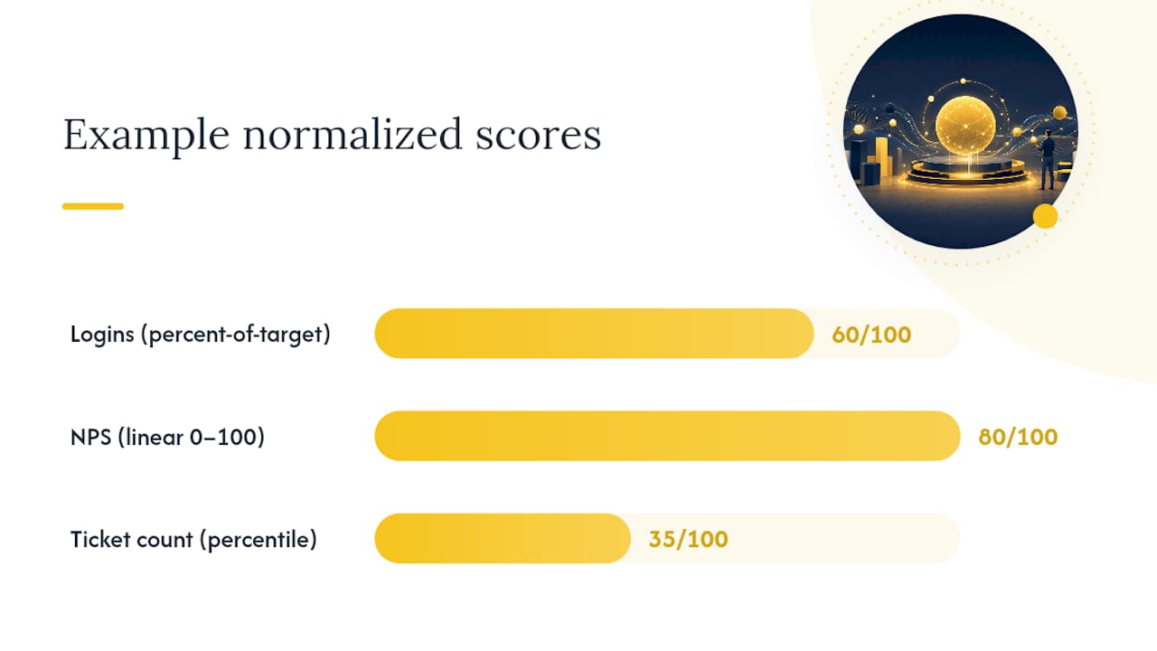
A few quick conversions: a customer averaging 12 logins a month against a target of 20 becomes 60 (percent-of-target). An NPS response of 8 out of 10 becomes 80 on a straight linear scale. A ticket count of 3 in a customer base where the median is 5 and the 90th percentile is 25 might land around the 35th percentile, meaning fewer tickets than most, converted to a 35.
Winsorize extreme outliers (cap the top and bottom 1-2% of values) before scaling, and document every normalization rule you choose. That documentation is what makes the score explainable to a CSM asking "why did this account drop 15 points?", a level of measurement rigor consistent with NIST's guidance on scaling methods.
How Do You Weight and Calculate the Final Score?
Weighting is where most homegrown health scores go wrong, either because every metric gets an equal 20% slice regardless of predictive power, or because one enthusiastic data analyst assigns weights based on intuition rather than evidence. Here's the five-step method that avoids both traps.
- Select signals by segment. A seat-based SMB product and an outcomes-driven enterprise platform need different inputs. Don't force one signal set across every customer tier.
- Normalize every metric to 0-100, using the methods above, and apply the same method consistently across every account in a segment.
- Assign weights that sum to 1. A commonly cited starting point for seat-based B2B SaaS: Usage ~35%, Outcomes ~25%, Engagement ~15%, Sentiment ~15%, Support ~10%, per ooligo's weighting framework. Treat these as a hypothesis, not gospel.
- Compute the weighted sum and log every input value, normalized score, and weight used, what's often called scoring lineage. Without it, you can't explain a score drop six months later.
- Set band thresholds and a recalculation cadence. Decide upfront whether the score refreshes daily, weekly, or in real time for alerts, and stick to it.
The weights themselves need periodic scrutiny:
- Weights should reflect what actually predicts churn in your business, not what feels intuitively important.
- No single metric should exceed roughly 40% of total weight, or it starts functioning as a proxy score rather than a blended one.
- Revisit weights whenever you add a new product line or shift target segments.
- Keep a changelog of every weight adjustment so a score's history stays reconstructable.
What Does a Worked Health Score Calculation Look Like?
Numbers make the health score formula concrete. Here's a seat-based B2B example for a customer with 50 licensed seats and 32 active users.
That sums to a health score of 66.15, landing squarely in the yellow band. The per-metric breakdown tells the real story: support is the weakest link, dragging an otherwise solid account into at-risk territory. That's the diagnostic power a single blended number can't give you on its own.
An outcomes-focused enterprise account would shift the signal mix entirely, dropping usage weight in favor of milestone completion and executive engagement, since enterprise buyers often care less about daily logins and more about whether the platform delivered the business case they signed for. The spreadsheet layout stays identical: metric, raw value, normalization rule, normalized score, weight, weighted value. Only the weights and metric selection change by segment.
- Build one tab per customer segment, since a single universal formula rarely fits both SMB and enterprise well.
- Sort the weighted-value column to instantly see which metric is dragging a score down.
- Store the raw values alongside normalized scores so you can audit calculations later.
How Do You Validate That a Health Score Predicts Churn?
A formula that hasn't been tested against real outcomes is a guess with decimal points. Backtesting is what turns your model into something you can defend to leadership.
Pull 6 to 12 months of historical account data, calculate what each account's health score would have been at various points in time, and compare those scores against what actually happened: renewed, churned, or expanded. This retrospective approach is standard practice for calibrating customer health score thresholds, and it's the only reliable way to know if your 70-100 green band is actually low-risk in your business.
Four metrics matter most during validation:
- Precision: of the accounts you flagged red, how many actually churned?
- Recall: of the accounts that actually churned, how many did your model flag in time to act?
- ROC/AUC: how well does the score rank churners above non-churners across every possible threshold?
- Lift vs. random baseline: does the model outperform simply guessing based on account size or tenure alone?
When results disappoint, resist the urge to add five more metrics. Adjust weights first, add or remove one signal at a time, and test each change against a holdout set of accounts you didn't use to build the model, ideally a time-based holdout matching your renewal cadence, so you're not accidentally training on data from the future. Recalibrate quarterly at minimum, or after any major product or pricing change, and keep the same governance owner across cycles so institutional knowledge doesn't evaporate every time someone leaves the team.
How Should You Operationalize the Score Day to Day?
A formula living in a spreadsheet helps nobody at 3pm on a Tuesday when a CSM needs to know which of their 40 accounts to call first. Getting the score into daily workflow means solving data sourcing, cadence, and presentation together.
Pull from four canonical sources: product telemetry (tools like Mixpanel, PostHog, or Amplitude), CRM touchpoints (HubSpot or Salesforce), support systems (Intercom or Zendesk), and billing platforms (Stripe or Chargebee). Each needs a rollup layer, since raw event data has to be aggregated into the daily or weekly metrics your formula actually consumes.
Cadence depends on use case. Real-time scoring makes sense for alerts, like a payment failure that should trigger outreach within hours. Daily or weekly recalculation is usually enough for dashboards CSMs check during their morning routine. Running everything in real time adds infrastructure cost without adding much predictive value.
Most teams outgrow spreadsheets fast, moving to a BI tool, then eventually to an embedded customer health scoring platform that connects directly to CRM and billing systems via API, cutting out the manual export step entirely. A well-built account health dashboard should show three things at once: the overall score, the top two or three negative drivers behind it, and the per-metric contribution breakdown, so a CSM opening the dashboard sees not just "this account is yellow" but exactly why.

Pro Tip: Give every score a one-line explanation string, like "Score dropped 12 points due to reduced feature adoption and one unresolved escalation." That single sentence is often the difference between a CSM trusting the number and a CSM ignoring it.
What Mistakes Wreck a Health Score's Credibility?
The fastest way to kill adoption of a health score is to make it a black box. If a CSM can't explain why an account dropped from green to yellow, they'll stop using the score within a month, regardless of how statistically sound the underlying model is. Explainability isn't a nice add-on; it's the difference between a score CSMs act on and one they route around.
Watch for these recurring failure patterns:
- Opaque models: if nobody on the CS team can explain a score without opening a data pipeline, trust erodes fast.
- Stale signals: a metric that hasn't updated in 30 days is worse than no metric at all, since it creates false confidence.
- Unbalanced weights: letting one metric dominate (often usage, because it's easiest to measure) turns a blended score into a single-metric score wearing a disguise.
- Ignoring segments: applying one weight set across SMB and enterprise accounts almost always underperforms segment-specific models.
- Ignoring seasonality: a fixed threshold turns every expected dip red, like a school in summer or a retailer after the holidays. Compare each account against its own history and usage rhythm, so a seasonal lull is not read as churn risk while the same drop in an account that never shows one is.
- Data quality gaps: a broken integration silently zeroing out a metric can tank scores across an entire customer base overnight.
Best practice fixes are straightforward: require a per-score explanation for every account, version-control your weighting rules the same way you'd version code, build segment-specific models where the business justifies it, and assign one named owner accountable for the scoring model, its changelog, and periodic audits timed to your renewal cycles.
Why This Methodology Reflects Real Practitioner Experience
Building a health score formula that CSMs actually trust takes more than assembling a spreadsheet once and calling it done. It requires the same discipline data teams apply to any predictive model: clean inputs, documented transformations, and honest validation against outcomes that already happened.
- The normalization and weighting steps in this guide follow the same structure used across established customer health score frameworks, adapted specifically for seat-based and outcomes-driven B2B SaaS motions.
- Customerscore automates the normalization, weighting, and explainability layers described here, pulling directly from billing, product usage, CRM, and support data instead of requiring manual spreadsheet updates.
- The platform's AI-driven scoring generates the same kind of per-metric explanation strings recommended above, so CSMs see the "why" behind every score change, not just the number.
- Integrations with HubSpot, Salesforce, Stripe, Mixpanel, PostHog, Segment, Chargebee, and Intercom map directly onto the four canonical data source categories covered in the operationalization section.
None of this replaces the judgment call every CS leader has to make: which signals matter for your product, and how much weight each one deserves. But the mechanics, normalize first, weight deliberately, backtest relentlessly, are consistent regardless of what tooling executes them.
Why Most Health Scores Fail Before They Ever Predict Churn
The conventional advice on health scores obsesses over the formula and skips the part that actually determines whether it works: whether anyone believes it. I've watched CS teams spend weeks tuning weights to the second decimal point on a model nobody backtested against a single renewal cycle. That's backward. A rough formula validated against real churn data beats an elegant one nobody tested.
The other blind spot is treating "usage" as one signal instead of a family. Login counts feel like health. They rarely predict it. What predicts renewal is whether someone reached an outcome, and most teams don't instrument outcomes at all because it's harder than pulling a login table.
If you take one thing from this piece, make it this: build the smallest defensible model you can validate, then earn complexity through backtesting, not intuition. Start with three or four signal families, prove they correlate with your actual churn, and only then add nuance.
Put This Formula to Work Without Building It Yourself
Every step in this guide, normalizing metrics, assigning defensible weights, backtesting bands against renewal data, is exactly what Customerscore automates for B2B SaaS teams who'd rather act on a score than maintain the spreadsheet behind it.
Instead of manually pulling data from Stripe, HubSpot, Mixpanel, and Intercom into a normalization tab every week, Customerscore's AI-powered health scoring platform pulls those sources automatically and generates explainable, per-metric score breakdowns your CSMs can actually act on. If churn prediction and renewal risk are what keep you up at night, the churn prediction software applies this same weighted, calibrated methodology to flag at-risk accounts before they hit your red band. Teams evaluating alternatives to tools like Churnkey can also see how Customerscore approaches churn prevention with a different data and scoring model.
If you want to see how a predictive health score works in practice, book a demo and walk through it with the team.
Frequently Asked Questions
What is the basic health score formula for SaaS customers? The canonical formula is Health = Σ(normalized_metric × weight), where each metric is scaled to 0-100 and weights sum to 1, as outlined in Metabase's health score methodology.
What weights should I use for a customer health score formula? A common starting point for seat-based B2B SaaS is Usage 35%, Outcomes 25%, Engagement 15%, Sentiment 15%, and Support 10%, per ooligo's weighting framework, adjusted after backtesting against your own churn data.
How do I calculate health score thresholds for green, yellow, and red bands? Start with 70-100 green, 40-69 yellow, and below 40 red, then run a retrospective backtest over 6 to 12 months of renewal data to confirm those cutoffs actually separate churned accounts from retained ones.
How often should a customer health score be recalculated? Use real-time updates for critical alerts like payment failures, and daily or weekly recalculation for standard dashboards; most CSM workflows don't need more frequency than that.
What's the biggest mistake teams make with a wellness scoring method for customers? Skipping normalization before weighting is the most common technical error, since it lets high-volume metrics like ticket counts overpower bounded ones like NPS regardless of the weight assigned.
Can the same health index formula work for both SMB and enterprise segments? Rarely without adjustment. Segment-specific models that shift weight toward usage for SMB and toward outcomes for enterprise consistently outperform a single universal formula.
Sources
- Customer Health Score: Definition, Weighting & SQL for Metabase
- Customer health score | ooligo
- Customer Health Score calculator (NovaCalculator)
Recommended
Related articles
Cut CSM Intervention 18%: Predictive Playbooks for CS & RevOps
Cut CSM Intervention 18%: Predictive Playbooks for CS & RevOps ! Predictive playbook geometric title card Predictive playbooks link a churn prediction to a specific, repeatable action so customer
BlogPinpoint B2B SaaS Adoption Gaps and the Fix That Lifts Renewal
Pinpoint B2B SaaS Adoption Gaps and the Fix That Lifts Renewal ! Analysts reviewing SaaS adoption gaps Adoption gap analysis identifies the funnel stage where eligible users or accounts fail to reach
BlogAnalysts: 6–12 Month Cohort Forecasts for Net Dollar Retention
Analysts: 6–12 Month Cohort Forecasts for Net Dollar Retention ! Analyst reviewing cohort retention forecast The most reliable way to forecast net dollar retention is cohort-based modeling that
BlogStop Surprise Churn: 5 Phase Data Mapping for RevOps and CS
Stop Surprise Churn: 5 Phase Data Mapping for RevOps and CS ! Analyst mapping customer data fields Data mapping for CS means connecting product usage, billing, CRM, and support data to the fields your