
Customer Journey Mapping for SaaS: A Practical Playbook


A SaaS customer journey map is a stage-based, data-backed blueprint that shows how users discover, adopt, and expand with your product, linking each touchpoint to business outcomes like NRR, churn rate, and CAC. Before you read another word, here are three things you can do in the next hour to start mapping:
- Pick one high-value persona and scope a single stage (onboarding is almost always the right first choice).
- Pull two quantitative signals from your product analytics and billing tool, such as weekly active users and invoice payment status.
- Run three customer interviews or pull three support transcripts to surface what users actually feel at that stage, not what you assume.
That's the minimum viable starting point. Everything else in this guide builds on those three moves.
Key Takeaways
A SaaS customer journey map only drives results when it is wired into automated playbooks, owned by named individuals, and updated every quarter with real behavioral data.
| Point | Details |
|---|---|
| Start narrow, then expand | Scope one persona and one stage first; expand after the process proves out. |
| Five rows per stage | Use actions, emotional state (0–10), pain points, opportunities, and owner to structure every stage column. |
| Moments of truth first | Prioritize the first "aha," the first support contact, and the pre-renewal window for the highest ROI. |
| Operationalize with triggers | Wire map insights into health score rules and automated playbooks so interventions run without manual effort. |
| Customerscore as the engine | Customerscore connects billing, product, CRM, and support data into explainable health scores and automated playbooks that act on your map findings. |
Table of Contents
- What is customer journey mapping in SaaS, and how does it differ from funnels and lifecycle maps?
- Why mapping the customer journey moves SaaS business metrics
- What are the stages of a SaaS customer journey, and what should you track at each one?
- How do you build a SaaS customer journey map step by step?
- How long does it take to map and operationalize a SaaS customer journey?
- Which tools help you collect data and visualize your SaaS journey map?
- How do you turn a journey map into automated playbooks?
- What mistakes kill SaaS journey maps, and how do you avoid them?
- How do you measure whether your journey mapping is actually working?
- What practitioners get wrong about journey mapping in B2B SaaS
- Customerscore turns your journey map into a live retention engine
- Sources
What is customer journey mapping in SaaS, and how does it differ from funnels and lifecycle maps?
A SaaS customer journey map is a stage-based framework, typically covering 5–7 stages, that visualizes user actions, emotions, and touchpoints and connects them directly to business metrics like CAC, LTV, and NRR. The goal is to show the real experience, not the designed one, so your team can find the gaps between what you built and what users actually do.
Three artifacts get confused constantly:
- Journey map: Detailed, operational, stage-level. Shows user actions, emotions, pain points, and owners at each touchpoint. Best for diagnosing specific friction and assigning fixes.
- Lifecycle map: High-level view of the customer relationship from acquisition through advocacy. Useful for executive alignment and measuring stage-level health. Lifecycle maps complement journey maps rather than replacing them.
- Funnel: Linear, conversion-focused, typically owned by marketing or sales. Best for measuring drop-off between acquisition stages, not for understanding why users churn post-activation.
| Artifact | Primary purpose | Granularity | Typical owner | Best used when |
|---|---|---|---|---|
| Journey map | Diagnose friction, assign fixes | Touchpoint-level | Product / CS | You need to improve a specific stage |
| Lifecycle map | Track relationship health over time | Stage-level | CS / RevOps | You need executive-level visibility |
| Funnel | Measure conversion drop-off | Step-level | Marketing / Sales | You need to improve acquisition or trial conversion |
The practical rule: start with a lifecycle map to orient stakeholders, then zoom into a journey map for the stage that hurts most.
Why mapping the customer journey moves SaaS business metrics
The mechanism is direct. When you know exactly where users stall, what they feel at that moment, and who owns the fix, you can intervene before the damage shows up in your churn rate. Lower churn compounds into higher LTV. Higher LTV justifies higher CAC.
Onboarding is where this plays out most visibly. Companies that optimize onboarding see materially higher retention and trial-to-paid conversion, because the first "aha moment" is the single highest-leverage event in the entire SaaS journey. Miss it, and no amount of downstream nurture recovers the account. Find it, instrument it, and shorten the path to it, and your activation rate moves within weeks.
Three measurements that confirm your mapping is working:
- Activation rate rising after you redesign the onboarding flow based on map findings.
- Trial-to-paid conversion improving when you address the friction points surfaced in qualitative interviews.
- NRR trending above 100% as expansion playbooks trigger at the right moments in the adoption stage.
Pro Tip: Track these three metrics before you start mapping so you have a clean baseline. A map without a baseline is just a diagram.
What are the stages of a SaaS customer journey, and what should you track at each one?
The model below covers seven stages. Some teams collapse consideration and trial into one stage; enterprise teams sometimes split adoption into "light usage" and "power usage." Either is fine, as long as every stage has a clear entry and exit criterion.
Identifying moments of truth at each stage, the interactions that disproportionately determine conversion and retention, is what separates a useful map from a decorative one. The three highest-leverage moments of truth in most B2B SaaS products are the first "aha" (onboarding), the first support contact (adoption), and the pre-renewal window (retention).
| Stage | User goal | Key touchpoints | Moment of truth | KPIs to track |
|---|---|---|---|---|
| Awareness | Understand the problem and discover solutions | Blog, ads, G2/Capterra, word of mouth | First meaningful content interaction | Organic traffic, CAC by channel |
| Consideration / Trial | Evaluate fit, start a trial | Product demo, trial signup, pricing page | Trial signup or first login | Trial start rate, time-to-first-login |
| Onboarding / Activation | Reach first value | In-app guides, welcome email, CS kickoff | First "aha moment" | Activation rate, time-to-value (TTV) |
| Adoption / Usage | Build habits, expand use cases | Feature discovery, in-app tips, support | First support contact | DAU/WAU ratio, feature adoption depth |
| Retention / Renewal | Confirm ongoing value, renew | Renewal email, QBR, health score alert | Pre-renewal health check | Churn rate, NRR, renewal rate |
| Expansion | Upgrade or add seats/modules | Upsell email, CS outreach, in-app prompt | Expansion conversation trigger | Expansion ARR, upsell conversion rate |
| Advocacy | Refer peers, leave reviews | NPS survey, referral program, community | NPS response or referral action | NPS score, referral rate, reviews |
For SaaS onboarding best practices specifically, the signals that matter most are time-to-value, the number of key actions completed in the first seven days, and whether the user has invited a teammate. Those three events predict 30-day retention better than almost any other early signal.
SaaS journeys are rarely linear. Users re-enter stages after a feature release, a team change, or a pricing shift. Plan for those re-entry points and instrument multiple entry paths rather than assuming a single funnel.
How do you build a SaaS customer journey map step by step?
A reliable mapping project runs in nine steps. The recommended minimum research for a map you can actually act on is 5–8 user interviews, behavioral analytics covering funnels, and any NPS or CSAT data you already have.
- Scope and objectives. Define which stage you're mapping and what business outcome you're trying to move. "Improve onboarding to raise 30-day activation from 40% to 55%" is a scope. "Map the whole journey" is not.
- Identify ICPs and personas. Segment by company size, role, and use case. A VP of Sales at a 200-person company has a completely different journey than a solo founder.
- Collect quantitative signals. Pull product event data (Mixpanel, PostHog), billing events (Chargebee, Stripe), and CRM data (HubSpot, Salesforce). Look for drop-off points, stall patterns, and usage gaps.
- Run qualitative interviews. Five to eight interviews with users at the target stage. Ask what they were trying to do, what got in the way, and what they felt. Record and transcribe.
- Map the current state. Use the five-row template per stage: user actions, emotional state (0–10), pain points, opportunities, and internal owner. Fill it with real data, not assumptions.
- Identify moments of truth and pain points. Mark the two or three interactions where emotion drops sharpest or where quantitative data shows the biggest drop-off.
- Build the future state and playbooks. For each pain point, define the intervention: a product change, an automated message, a CS outreach, or a content piece.
- Assign owners and KPIs. Every opportunity on the map needs a name next to it and a metric that will confirm the fix worked.
- Run experiments and iterate. Treat each intervention as a hypothesis. Set a primary metric, a segment, and a minimum duration before you read results.
The five-row template layout
Each stage column in your map should contain exactly these rows:
- User actions: What the user literally does (clicks, emails, calls).
- Emotional state (0–10): A consistent numeric score so you can compare sentiment across stages and prioritize objectively.
- Pain points: What frustrates or blocks the user at this stage.
- Opportunities: Product, content, or CS interventions that could remove the pain.
- Internal owner: The team or person responsible for acting on the opportunity.
Prioritization: impact vs. effort
Once you have a list of opportunities, plot them on a 2x2 matrix: impact on your target metric (vertical axis) vs. effort to implement (horizontal axis). High-impact, low-effort items become your first sprint. High-impact, high-effort items go into the roadmap. Low-impact items get parked or dropped.
Convert each high-priority opportunity into a roadmap ticket with a hypothesis, a success metric, and a rollback condition. That's the handoff from mapping to execution.
How long does it take to map and operationalize a SaaS customer journey?
The honest answer depends on scope. A focused MVP map covering one stage can be done in two weeks. A full program covering all seven stages and wired into automated playbooks takes a quarter.
MVP timeline (one stage, two weeks):
- Week 1: Scope, pull quantitative data, run 5 interviews, draft current-state map.
- Week 2: Identify moments of truth, build future-state map, assign owners, define first experiment.
Full program timeline (one quarter):
- Month 1: MVP for the highest-priority stage, instrument missing signals, align stakeholders.
- Month 2: Expand to two additional stages, build health score model, wire first automated playbook.
- Month 3: Cover remaining stages, run first experiment cycle, establish quarterly review cadence.
Roles and who owns what:
- Product manager: Scope, prioritization, roadmap tickets.
- Product analytics: Instrumentation, funnel analysis, cohort data.
- Customer success: Qualitative interviews, playbook design, ownership of CS-triggered interventions.
- Sales: Awareness and consideration stage data, ICP validation.
- Marketing: Acquisition touchpoints, content mapping, NPS survey setup.
- Engineering: Instrumentation, event tracking, integration work.
For a small startup (under 20 people), one PM and one CS lead can run an MVP map in two weeks with roughly 40 person-hours total. A mid-market team (50–200 people) typically allocates a dedicated sprint, around 80–100 person-hours, across product, CS, and analytics. Enterprise programs often have a dedicated RevOps or CX team running the program full-time.
Cross-functional alignment is not optional. The most common reason mapping projects stall is that one team owns the artifact and no one else feels accountable for the findings.
Which tools help you collect data and visualize your SaaS journey map?
No single tool covers the whole job. You need a stack that covers product behavior, billing events, CRM data, support interactions, and feedback, then a layer to visualize and act on the combined signal.
Integration checklist by system:
- Product analytics (Mixpanel, PostHog): Track feature usage, funnel completion, session frequency, and cohort retention. Send events with consistent naming (e.g.,
feature_activated,onboarding_step_completed). - CDP (Segment): Unify events from web, mobile, and server into a single user profile. Route data to downstream tools without re-instrumentation.
- CRM (HubSpot, Salesforce): Store account-level context: deal stage, contract value, renewal date, stakeholder contacts. Stage-level NPS surveys can be automated from Salesforce to trigger on lifecycle stage entry.
- Billing (Chargebee, Stripe): Capture subscription events: trial start, plan upgrade, payment failure, cancellation. Payment failure is one of the strongest leading indicators of churn.
- Support (Intercom): Track ticket volume, first response time, and topic clustering by stage. A spike in support tickets during onboarding is a direct signal of a map gap.
- Feedback (NPS, in-app surveys): Run stage-entry surveys to measure satisfaction at each handoff. Link survey responses to user segments in your CDP.
What each tool type solves:
- Session replay tools (Hotjar, FullStory) show where users get stuck in the UI, which is the qualitative complement to funnel drop-off data.
- Cohort analysis in Mixpanel shows when users churn relative to their signup date, which tells you which stage is leaking.
- A CDP like Segment ensures every downstream tool sees the same user identity, so your health score model and your CRM agree on who a user is.
Pro Tip: Agree on event naming conventions before you instrument anything. A user_activated event in Mixpanel and a UserActivated event in your data warehouse are two different records. Inconsistent naming is the single biggest cause of unreliable journey data.
For a deeper look at how these platforms unify billing, product usage, and CRM into a single view, the best customer success software roundup covers the key integration patterns.
Real-time analytics also matter at the acquisition and consideration stages, where content performance data feeds directly into your awareness-stage map.
How do you turn a journey map into automated playbooks?
A map on a whiteboard does nothing. The value comes when you wire the insights into automated rules that trigger outreach or product interventions without a CS rep manually checking a spreadsheet every morning.

Real-time alerts and automated workflows that synthesize billing, product usage, and CRM data are what make operationalization possible at scale. The architecture is simple: a trigger fires when a user's behavior crosses a threshold, a rule evaluates the context, an action executes, and a measurement confirms whether it worked.
Sample playbook: declining engagement + overdue invoice
- Trigger: Weekly active users drop below the account's 30-day average AND an invoice is 7+ days overdue.
- Rule: Health score drops below 60. Account is flagged as at-risk.
- Action: Automated CS outreach email with a personal subject line, followed by a Slack alert to the account owner.
- Measurement: Track renewal rate for flagged accounts vs. control group over the next 60 days.
Operationalization also requires both a health-scoring model and a small set of deterministic rules. Non-ML playbooks (simple threshold rules) can run immediately while a machine learning churn model trains on enough data to be reliable.
Integration checklist for operationalization:
- CRM: Account owner, contract value, renewal date, stakeholder contacts.
- Billing: Subscription status, payment history, MRR, plan tier.
- Product events: Login frequency, feature adoption depth, onboarding completion.
- Support tickets: Open ticket count, ticket age, topic category.
- NPS: Score, verbatim response, survey date.
Customerscore pulls all five of these data streams into a single health score per account. The health score is explainable, meaning you can see exactly which signals drove it down, not just a number. When the score drops, Customerscore fires a playbook automatically: a CS task, an email sequence, or a Slack alert, depending on the rule you configure. For churn prediction specifically, the model surfaces at-risk accounts 30–60 days before renewal, giving CS teams enough runway to intervene.
The customer success playbooks feature in Customerscore maps directly to the moments of truth you identified in your journey map. You define the trigger, the rule, and the action once. The platform runs it at scale.
What mistakes kill SaaS journey maps, and how do you avoid them?
Top 5 mapping mistakes:
- Mapping only the happy path. Most maps show what happens when everything goes right. The value is in mapping what happens when it goes wrong: the confused new user, the payment that fails, the feature that never gets adopted.
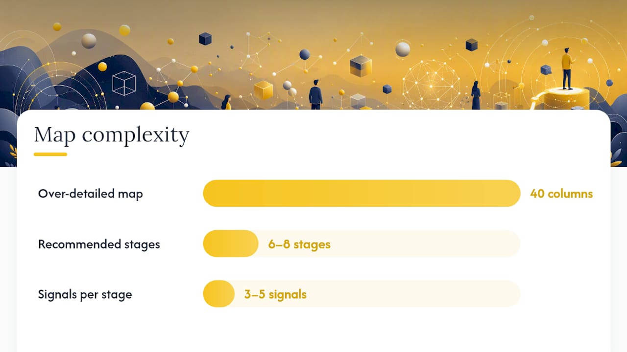
- Too much detail too soon. A 40-column map covering every micro-interaction is unusable. Start with 6–8 stages and 3–5 signals per stage. Add detail only where you find a moment of truth.
- No ownership. Every opportunity on the map needs a name. If it's everyone's job, it's no one's job.
- Treating the map as a static diagram. The most common mapping mistake is building a beautiful artifact and never updating it. A map that doesn't reflect the current product is worse than no map, because it sends teams in the wrong direction.
- Skipping qualitative research. Quantitative data tells you where users drop off. Interviews tell you why. You need both.
Top 5 best practices:
- Scope narrowly. One persona, one stage, one business outcome. Expand after you've proven the process works.
- Mix qualitative and quantitative. Pair funnel data with interview transcripts. The combination surfaces insights neither source reveals alone.
- Assign owners and KPIs at the map level. Not just "CS owns retention" but "Sarah owns the pre-renewal health check playbook, measured by renewal rate for at-risk accounts."
- Instrument the first "aha moment" explicitly. Define it as a named product event, track it in your analytics tool, and make it a primary metric in your activation dashboard.
- Run quarterly map audits. Product changes, pricing changes, and market shifts all invalidate map assumptions. A 90-minute cross-functional review every quarter keeps the map accurate.
Pro Tip: Use a consistent 0–10 emotional score across every stage. When you can see that emotion drops from 7 at trial signup to 3 at onboarding day 3, the prioritization conversation becomes obvious. Subjective descriptions ("users feel confused") are hard to rank; a score drop of 4 points is not.
For practical tactics on reducing churn in self-service SaaS, the activation and retention stages are where most of the leverage lives.
How do you measure whether your journey mapping is actually working?
Mapping without measurement is just documentation. The goal is to show that interventions informed by the map moved a metric.
Recommended KPIs by stage:
| KPI | Stage | What a positive change looks like |
|---|---|---|
| Activation rate | Onboarding | Rises after you shorten the path to the first "aha moment" |
| Trial-to-paid conversion | Consideration / Trial | Improves when friction points from interviews are removed |
| Time-to-value (TTV) | Onboarding | Decreases as onboarding flow is redesigned |
| NRR | Retention / Expansion | Climbs above 100% as expansion playbooks trigger correctly |
| Churn rate | Retention | Falls as at-risk accounts are caught earlier |
| Expansion ARR | Expansion | Grows as upsell triggers are tied to adoption milestones |
| NPS | Advocacy | Rises when stage-level satisfaction gaps are addressed |
Dashboard slice to build first:
- Cohort retention curve (30/60/90-day retention by signup cohort).
- Activation funnel (step-by-step completion rate through onboarding).
- Health score distribution (percentage of accounts by health tier: green, yellow, red).
- At-risk accounts list (accounts below health threshold with renewal date within 90 days).
Automating stage-level NPS surveys tied to lifecycle stage entry gives you a continuous satisfaction signal at each handoff, not just a quarterly pulse.
Experiment checklist:
- Hypothesis: "Changing X will improve Y by Z% for segment W."
- Primary metric: One number that confirms or refutes the hypothesis.
- Segment: The specific user cohort you're testing on.
- Sample size: Enough accounts to reach statistical significance before you read results.
- Minimum duration: At least two full billing cycles for retention experiments; two weeks for activation experiments.
What practitioners get wrong about journey mapping in B2B SaaS
Most teams treat journey mapping as a research project. They run a workshop, produce a beautiful Miro board, present it to leadership, and then watch it collect digital dust while the product ships features that contradict every insight on the map.
The teams that actually move metrics treat the map as an operating document. They wire it directly into their health scoring model, their playbook triggers, and their sprint planning. The map is not a deliverable. It's a decision-making tool that gets updated every quarter and challenged every time a new data point contradicts it.
The other thing practitioners consistently underestimate is the gap between the designed experience and the real one. You built an onboarding flow that takes 10 minutes. Your users are spending 45 minutes and still not completing it. That gap is where the churn lives. Closing it requires pairing your funnel data with actual interview transcripts, not just running another A/B test on button color.
The highest-ROI move in most B2B SaaS companies is not building a new feature. It's finding the two or three moments of truth where users are most likely to abandon and fixing those first. A 10-point improvement in activation rate compounds into significantly lower churn and higher NRR over 12 months. That's the payoff of an operationalized map.
Customerscore turns your journey map into a live retention engine
Most journey mapping guides end at the diagram. Customerscore starts where the diagram ends.
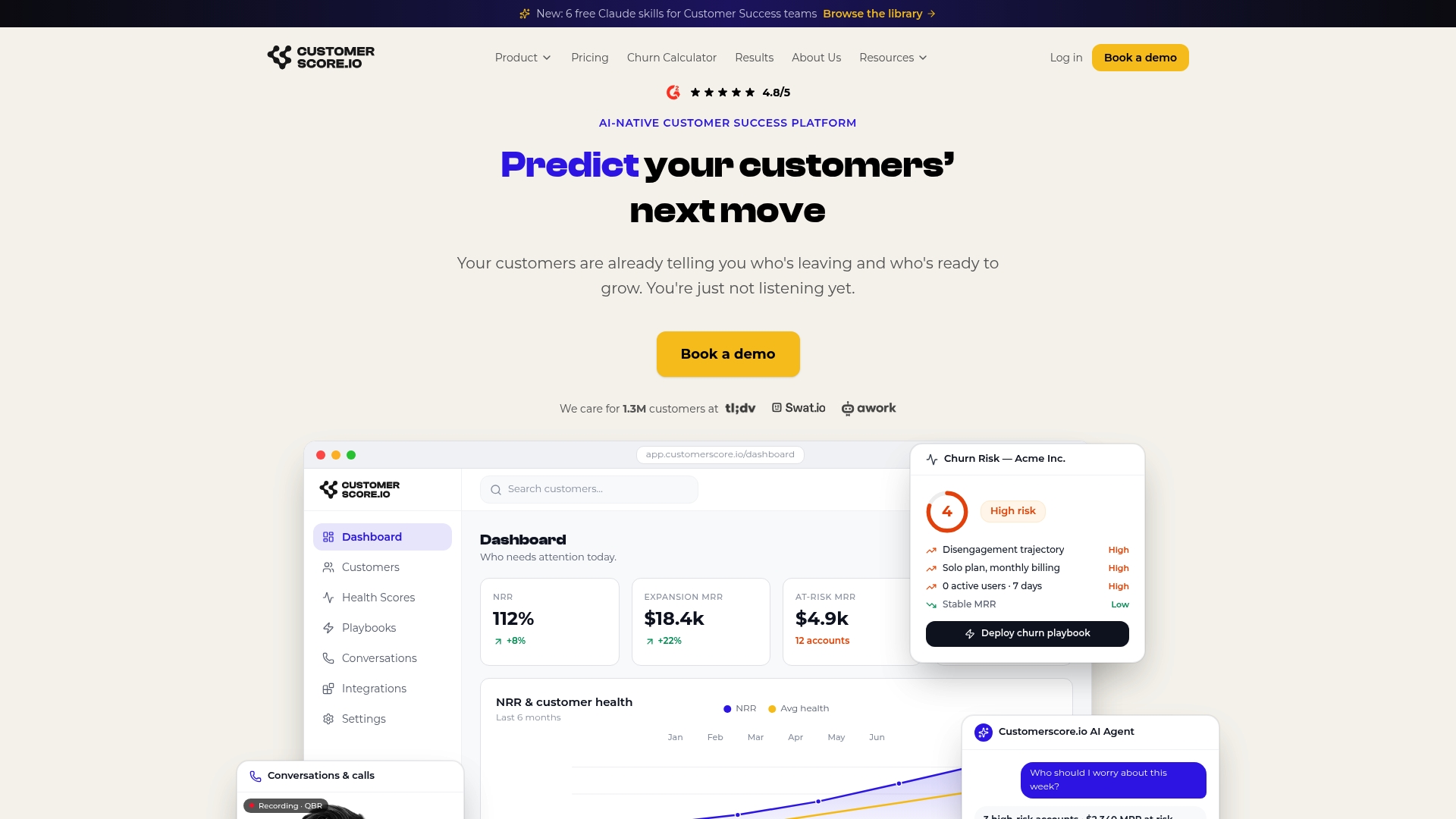
Customerscore connects your billing data (Chargebee, Stripe), product usage (Mixpanel, PostHog, Segment), CRM (HubSpot, Salesforce), and support (Intercom) into a single explainable health score per account. When that score drops, a playbook fires automatically: a CS task, an email, a Slack alert, or all three. You see exactly which signals drove the score down, not just a red dot on a dashboard.
The practical result: your CS team stops manually reviewing spreadsheets and starts working a prioritized list of at-risk accounts, each with a clear trigger and a pre-built response. Churn prediction surfaces risk 30–60 days before renewal. Health scoring makes expansion opportunities visible before the account owner thinks to ask.
If you've built your journey map and you're ready to wire it into automated playbooks, book a demo and see how Customerscore operationalizes it in your stack.
Sources
- SaaS Customer Journey Map: 7 Stages to Drive Growth | Miro
- SaaS Customer Journey Guide: Map, Optimise & Scale Every Stage | Surge45
- Customer Journey Map Template for SaaS PMs | IdeaPlan
- SaaS customer journey mapping best practices | Mouseflow
Recommended
Related articles
Benchmarked Save Playbooks: Two Churn Survey Questions for SaaS Teams
Benchmarked Save Playbooks: Two Churn Survey Questions for SaaS Teams ! Customer success manager reviewing churn survey The most effective churn survey for SaaS is a two-question in-flow cancel
Blog90–120 Day Renewal System for CSMs: SaaS Renewal Playbook
90–120 Day Renewal System for CSMs: SaaS Renewal Playbook ! Team planning a structured SaaS renewal Run renewals as a 90 to 120 day managed pipeline, not a calendar reminder.
BlogCut Response Time 60% with This Slack for Customer Success Playbook
Cut Response Time 60% with This Slack for Customer Success Playbook ! Customer success team routing a Slack conversation Slack works best for customer success when it functions as the conversation
BlogProduct Led Customer Success in 90 to 180 Days Without a Data Team
Product Led Customer Success in 90 to 180 Days Without a Data Team ! Customer success operator reviewing product signals Product-led customer success uses product usage data and in-product